The Overwolf Support Portal had the answers, but users couldn’t find them, so they turned to Reddit and Google. I redesigned routing, search, and the ticket experience to mirror how people actually seek help, increasing self-service by 19 points and reducing tickets by 23%, all within Freshdesk’s constraints.
Impact
Self-service success rate
+19pp
Ticket volume
−23%
Ticket form completion
+15pp
Project Snapshot
- Timeline
- September 2024 to June 2025
- Role
- Senior Product Designer (end-to-end individual contributor)
- Team
- 2 Engineers, Support Team
- Platform
- Web (desktop + mobile), Overwolf client widget
- Users
- PC gamers
Challenge
The answers existed, but finding them didn’t
The Overwolf Support Portal is the official resource for users seeking assistance and information. However, users often relied on external sources such as Reddit and Google, which Overwolf cannot control, because they had difficulty finding information on the portal. This increased the support workload and raised reliability concerns.
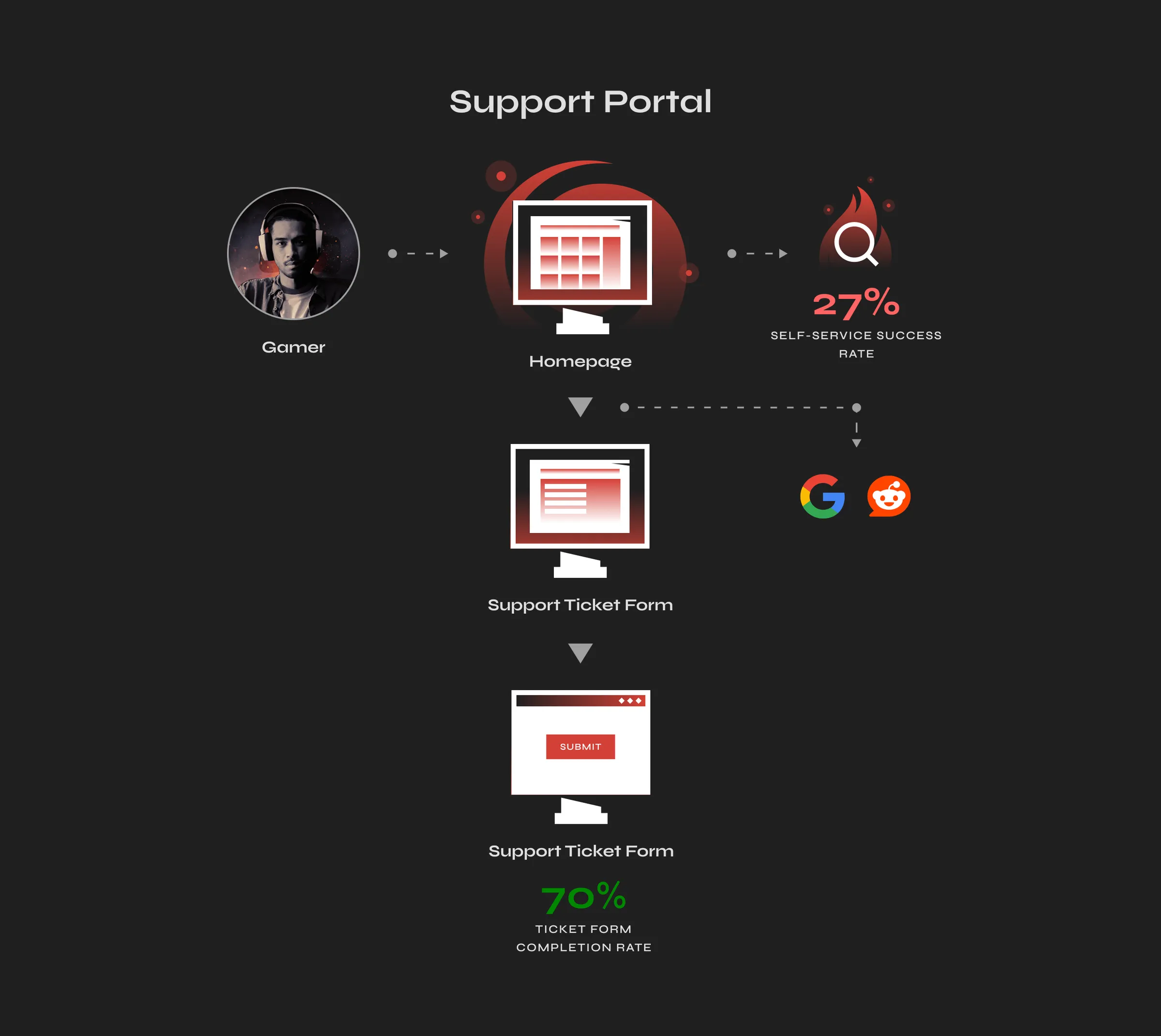
Improve routing and intake without restricting access to support
The challenge was not to redesign the portal entirely. Rewriting articles was not feasible in the short term due to limited capacity within the support team, and quality improvements would take months.
The core issue was structural. The portal’s information architecture did not align with how users solved problems, and the ticket form caused 30% of users to abandon it before submitting.
The objective was to increase self-service success and reduce ticket volume by resolving more issues, not by discouraging people from reaching out to support.
What I couldn’t change, and what I had to protect
Platform constraint
The portal runs on Freshdesk with limited customization, so solutions had to operate within the platform’s constraints.
Content constraint
Article quality couldn’t be improved in a short timeframe, so the redesign focused on making existing content more accessible.
Audience reality
88% of users access support via the Overwolf client or in-game apps, not the portal, so portal improvements required updates to the in-client widget.
Guardrail
Portal sessions had to remain stable. Any drop would signal deflection rather than resolution.
Where we started
Self-service success rate
27%
Ticket volume
100 indexed
Ticket form completion
70%
Discovery
Hours of observation beat months of satisfaction scores
I ran usability tests with nine users whose technical confidence ranged from casual to hardcore gamers, four in moderated sessions and five unmoderated on Userbrain. Each session focused on three tasks, including finding help for a specific error, submitting a support ticket, and checking the status of a prior request.
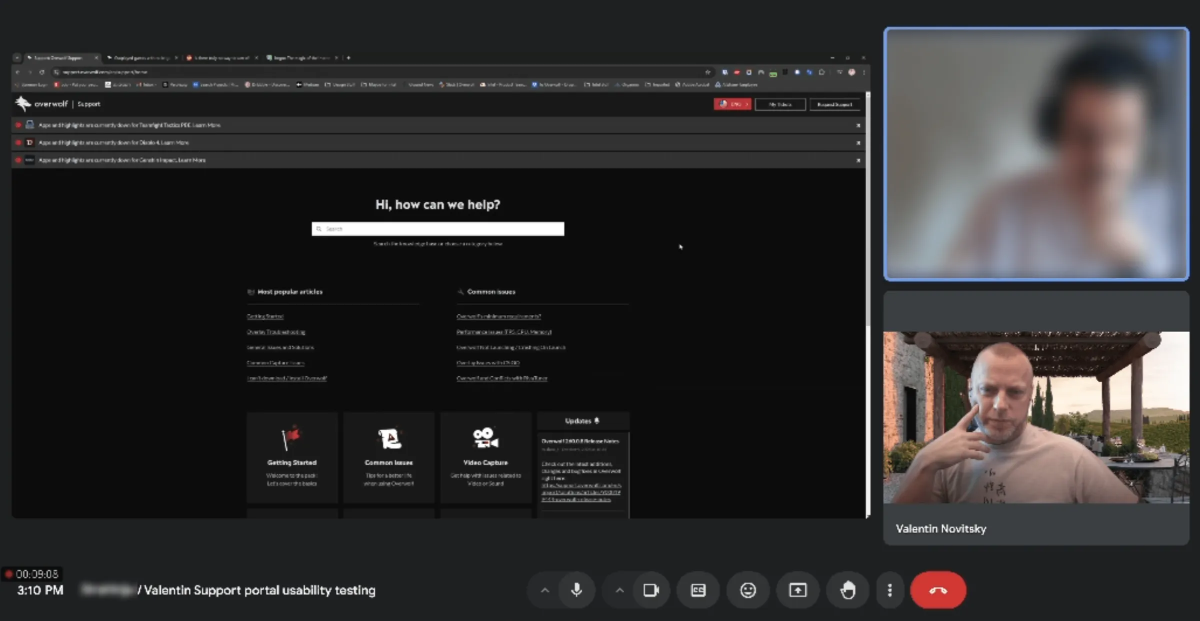
In addition to the sessions, I conducted a design audit by documenting the current state with screenshots and session recordings, mapping the information architecture, and cataloging terminology barriers and broken interaction patterns.

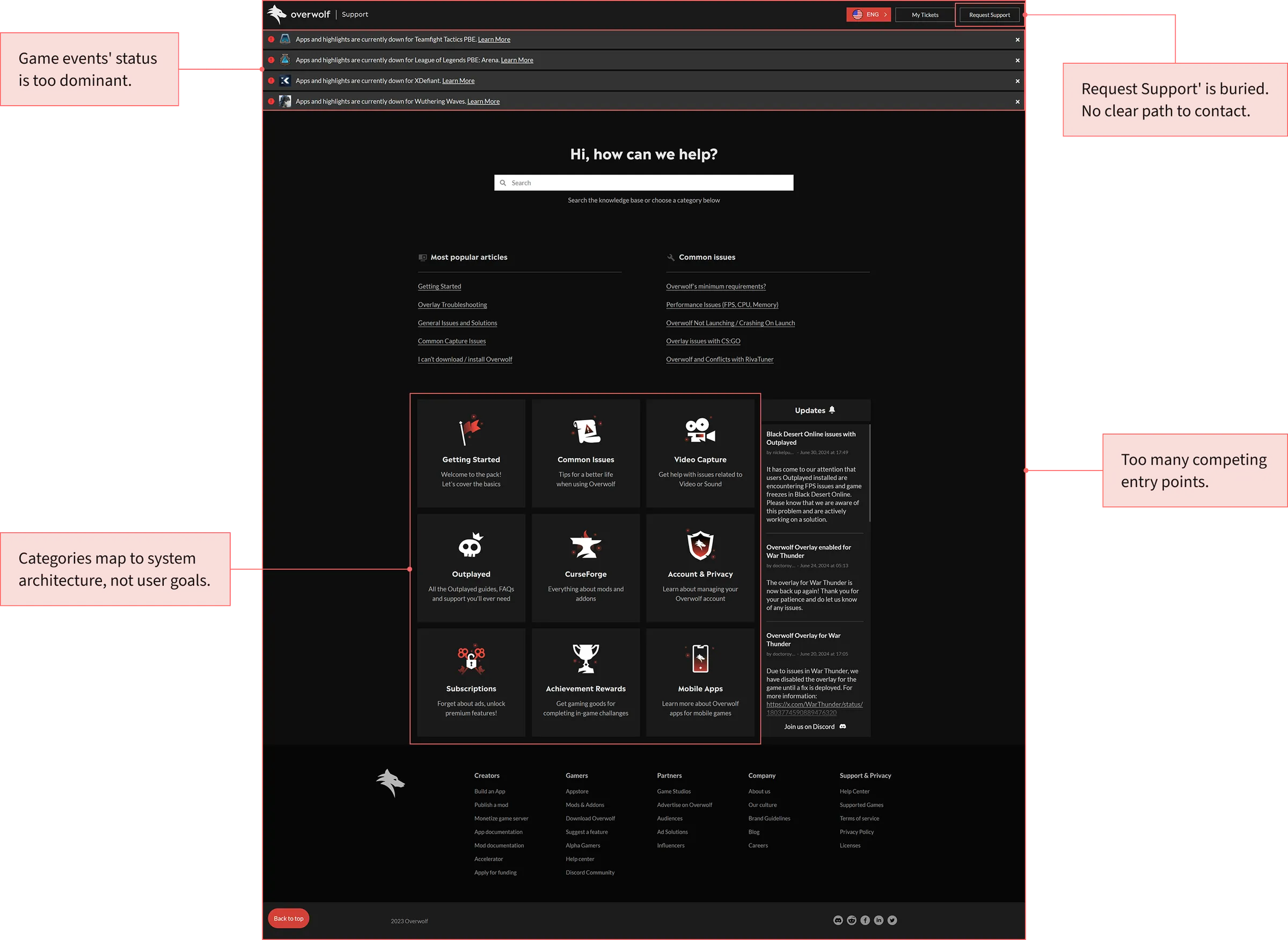
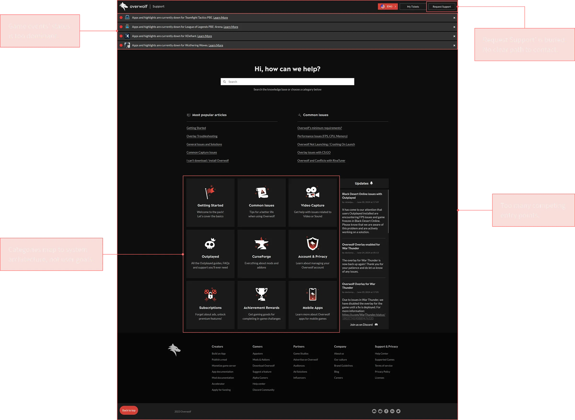
The Homepage spoke system language, not the user’s
The Homepage grouped content by system architecture rather than by user goals. It presented a wall of category cards, but it wasn’t clear which were informational and which were for problem-solving. Users had to check each category individually to find what they needed.
Search results were too broad, with no filtering options. Users tried multiple variations for specific issues, failed, and then found answers quickly on external sources.
The navigation made the portal harder to use. It was difficult to find the “Request Support” option, and clicking the portal logo took users out of the portal.
The Ticket Form created friction at the worst possible moment
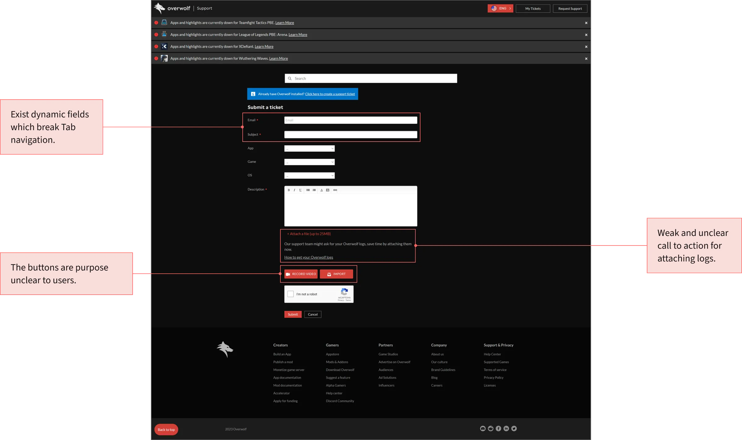
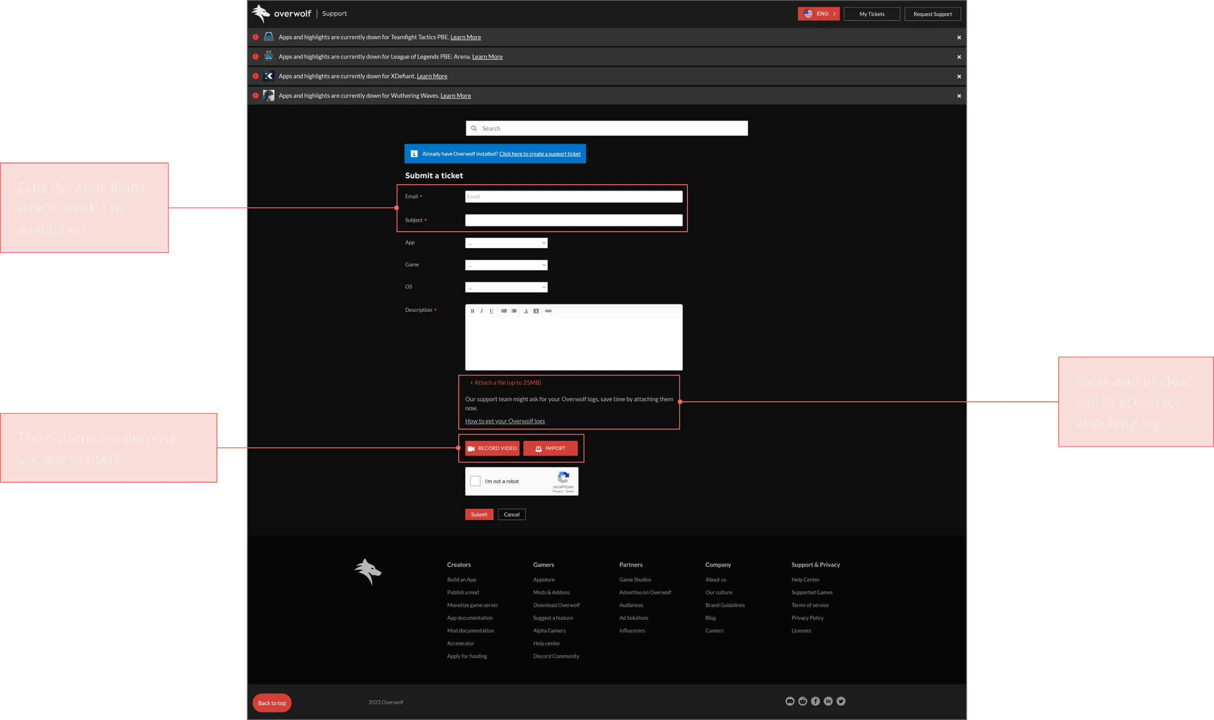
The form had severe usability failures. Dynamic fields disrupted Tab navigation, dropdowns lacked autosuggest, and the “Record Video” and “Import” features were confusing, leaving users unsure of their purpose.
Users seeking instructions on how to upload logs were redirected to another page. As a result, 30% of submitted tickets arrived without the logs agents needed, requiring follow-up. A CAPTCHA failure cleared all entered data, forcing users to start over.
Of the users who started the form, nearly a third abandoned it before submitting.
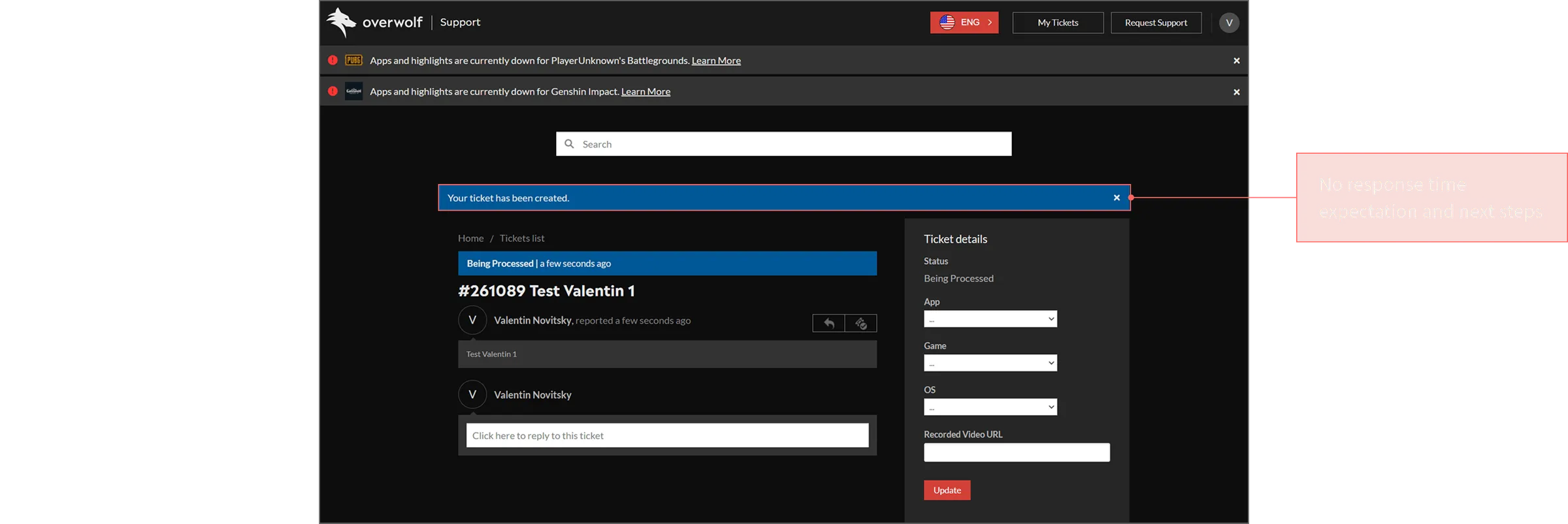
The Confirmation Page turned submission into a dead end
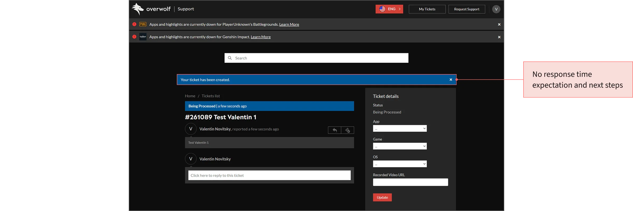
After submission, users had no clear sense of what would happen next. The flow provided no expected response time, no clear way to check status, and no next step to rely on.
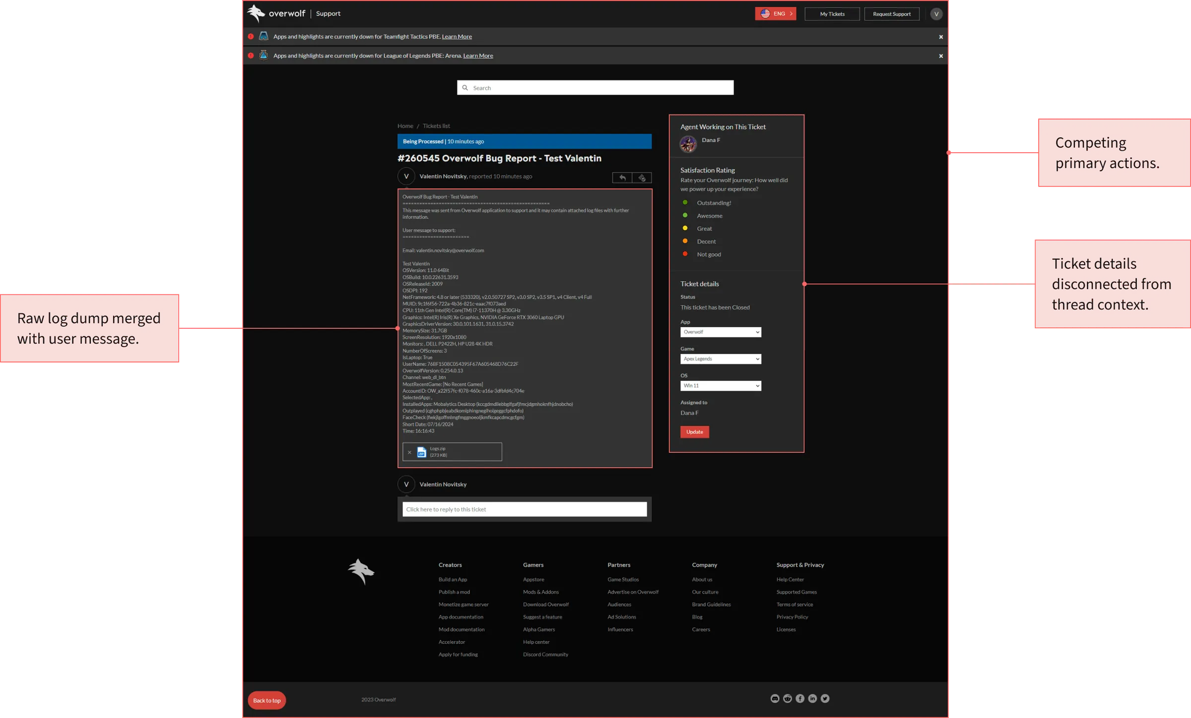
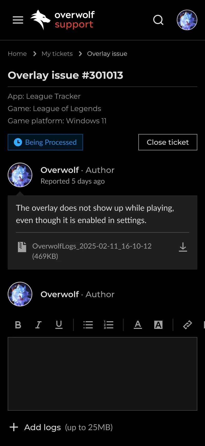
The Open Ticket Page felt like a raw admin form, not a conversation
The ticket detail page presented information without prioritizing user actions. Reading, replying, updating metadata, and uploading files all seemed equally important.
Raw system logs and the user’s message were merged into a single block, making them indistinguishable. The reply editor felt isolated rather than integrated into the conversation flow.
As a result, the backend admin view was technically complete but lacked clear guidance on next steps.

Key Discovery Insight
Users not only got lost in the portal but also abandoned it at the door.
Solution
Design the support journey around resolution, not the portal’s structure
Each solution addressed a root problem. Users had to translate their experience into the platform’s language.
I built a strategy to surface relevant content earlier, simplify intake, and clarify what happens after submission, removing the translation burden at every stage.
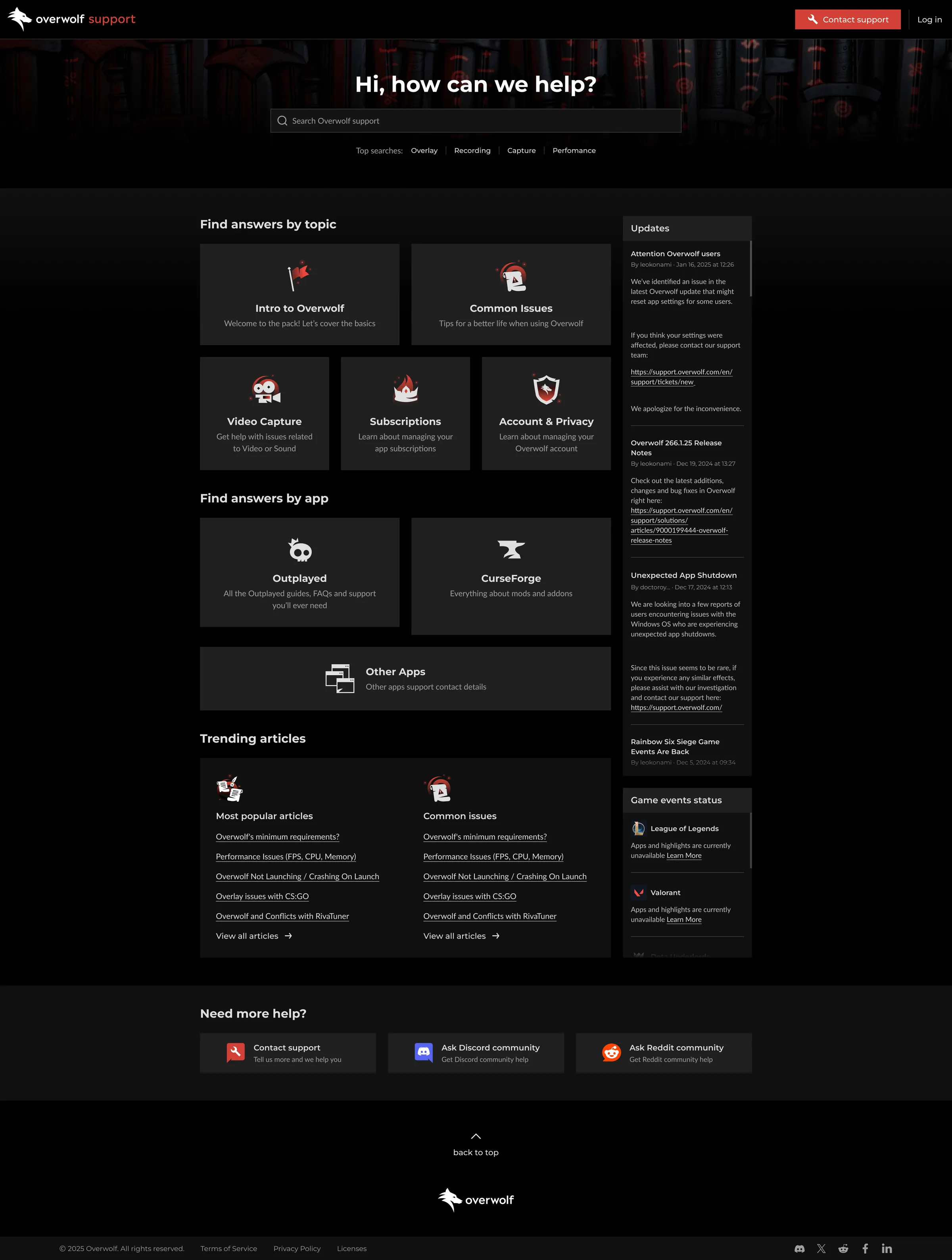
Restructure the homepage around user intent
The homepage category wall mirrored Overwolf’s backend structure rather than how users described their problems. A full taxonomy rebuild would have required changing Freshdesk’s category structure and migrating existing content, which was too costly given the scope and timeline.
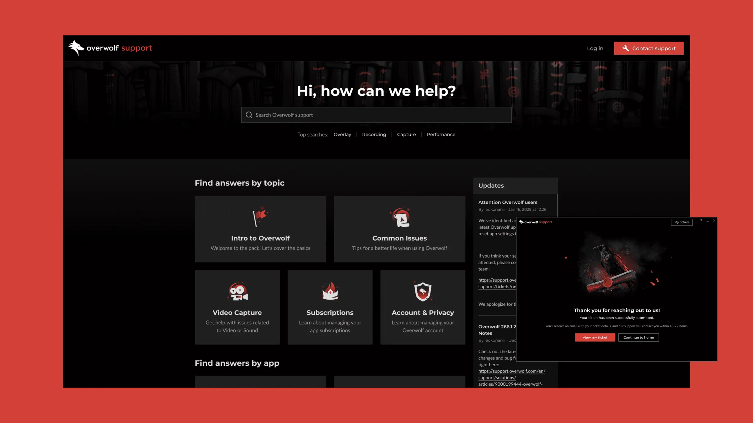
I chose a lower-risk layer above the existing structure. I reorganized the layout into “Find answers by topic” and “Find answers by app” and added a “Trending articles” section for common issues and popular articles.
I also added a “Need more help?” section with clear links to Contact support, Discord, and Reddit. Rather than resisting users’ external help-seeking behavior, the redesign acknowledged it and gave it a defined place in the flow.
Contact support replaced the buried “Request Support” button in the header, making the path to a human clear from every page.
Top search keywords were added near the search field. Because Freshdesk’s search couldn’t be customized for relevance or filtering, this helped reduce trial and error.
Reduce ticket friction and increase first-contact resolution
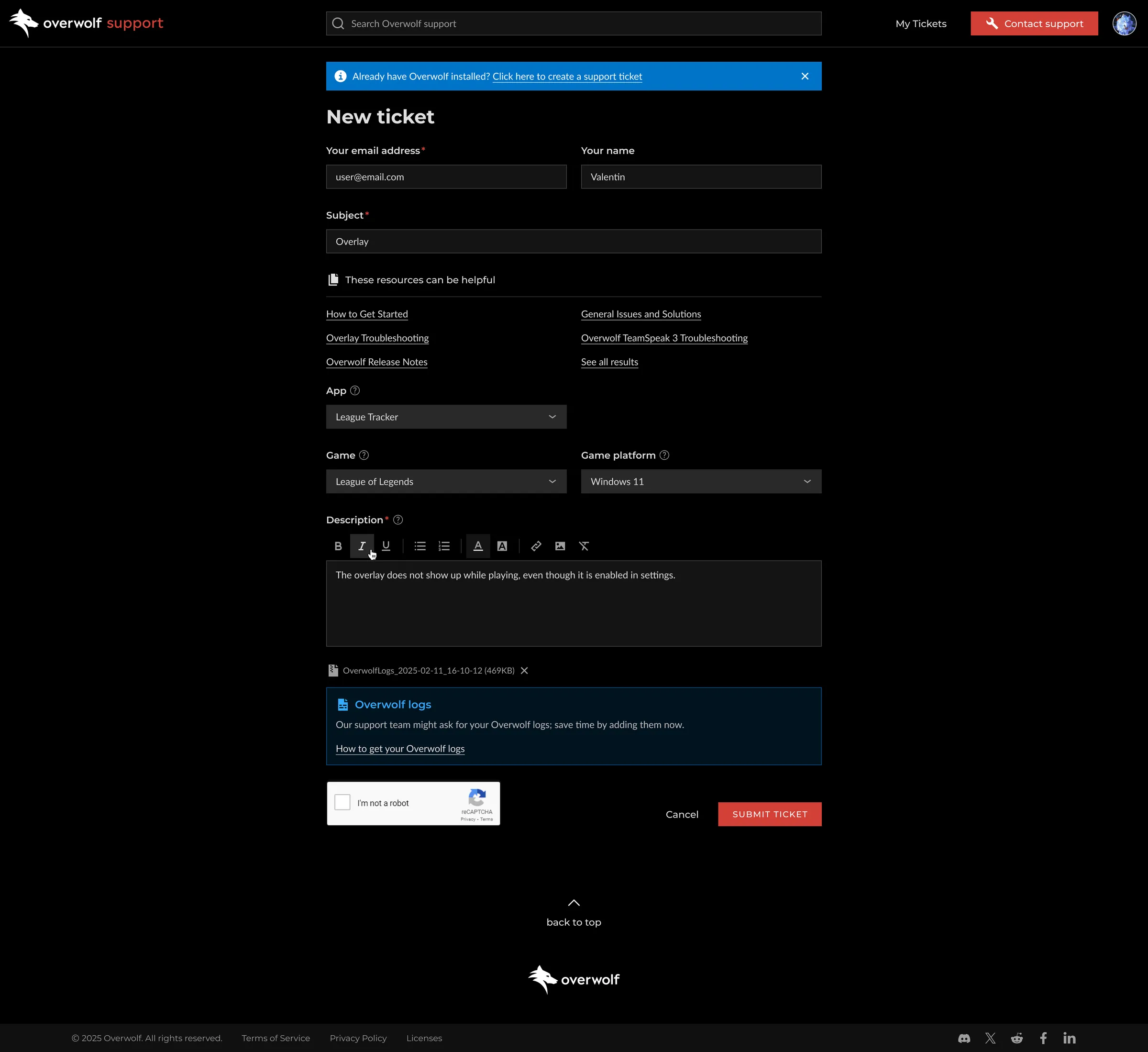
Fixing the CAPTCHA issue was our top priority because it was a major usability problem with a significant impact. Also, we canceled the dynamic field behavior so Tab navigation works as expected across the form.
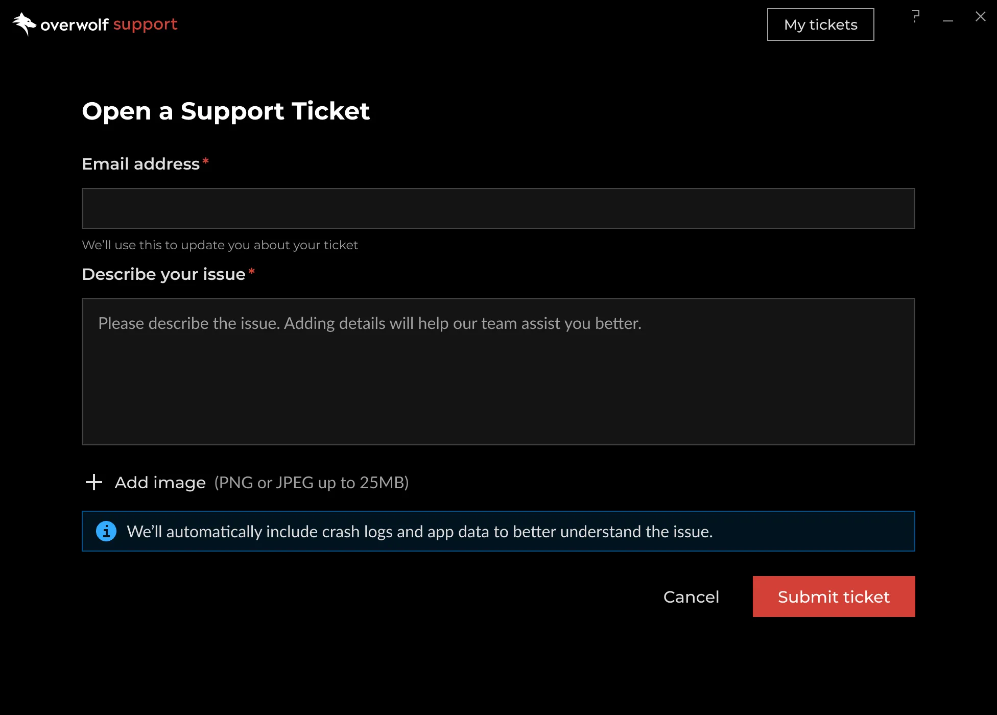
I added a “These resources can be helpful” feature that displays relevant articles when users enter the subject field. This allows users to find answers before submitting a ticket.
I replaced the confusing “Record Video” and “Import” features with a clear “Add logs” option and improved the CTA for creating logs. This moved log submission into the primary flow, so agents receive the diagnostic context they need upfront.
These updates help users fill out forms faster and with fewer mistakes. Now, more tickets include the details agents need to solve issues on the first try.
Remove uncertainty after submission
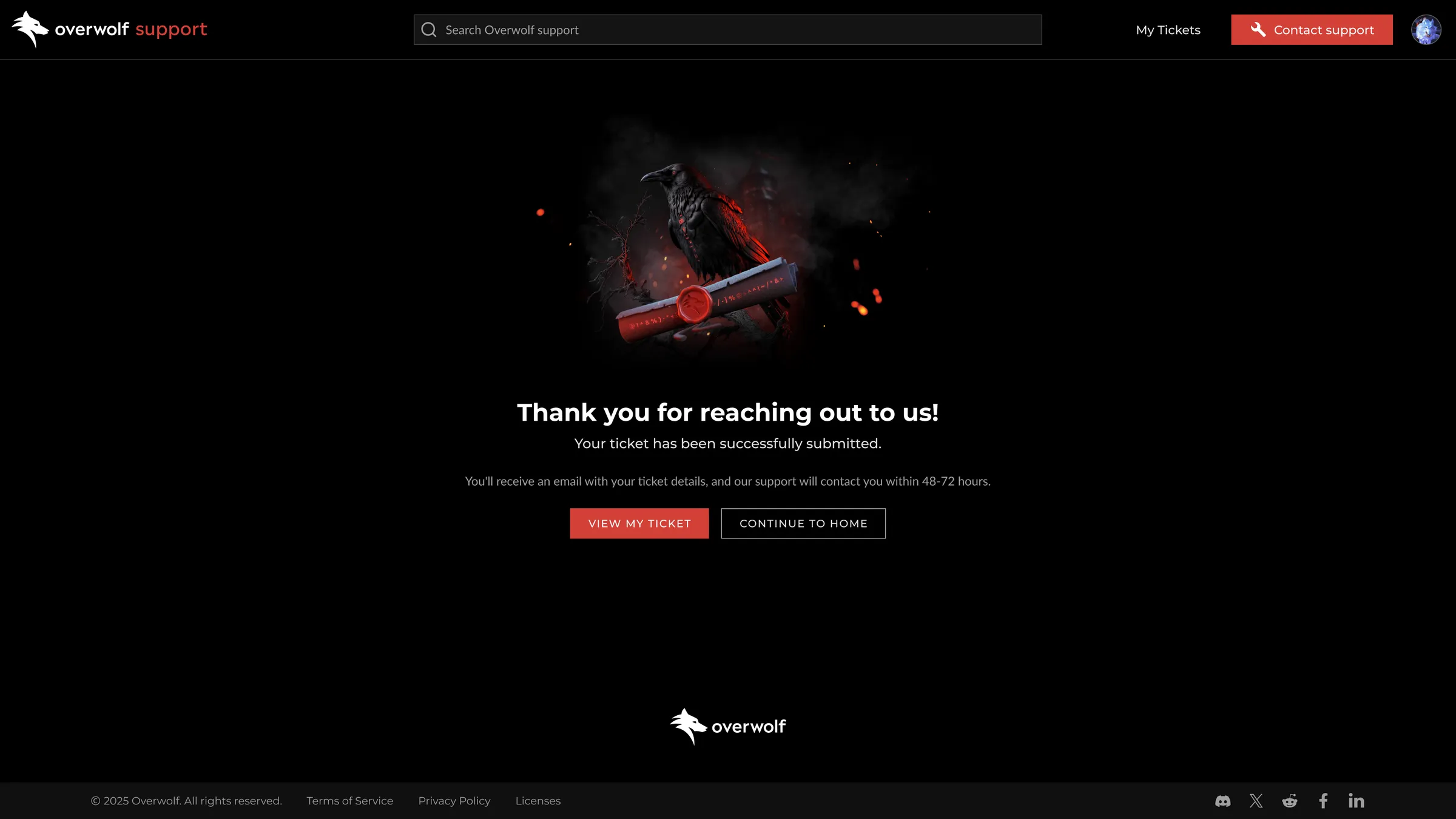
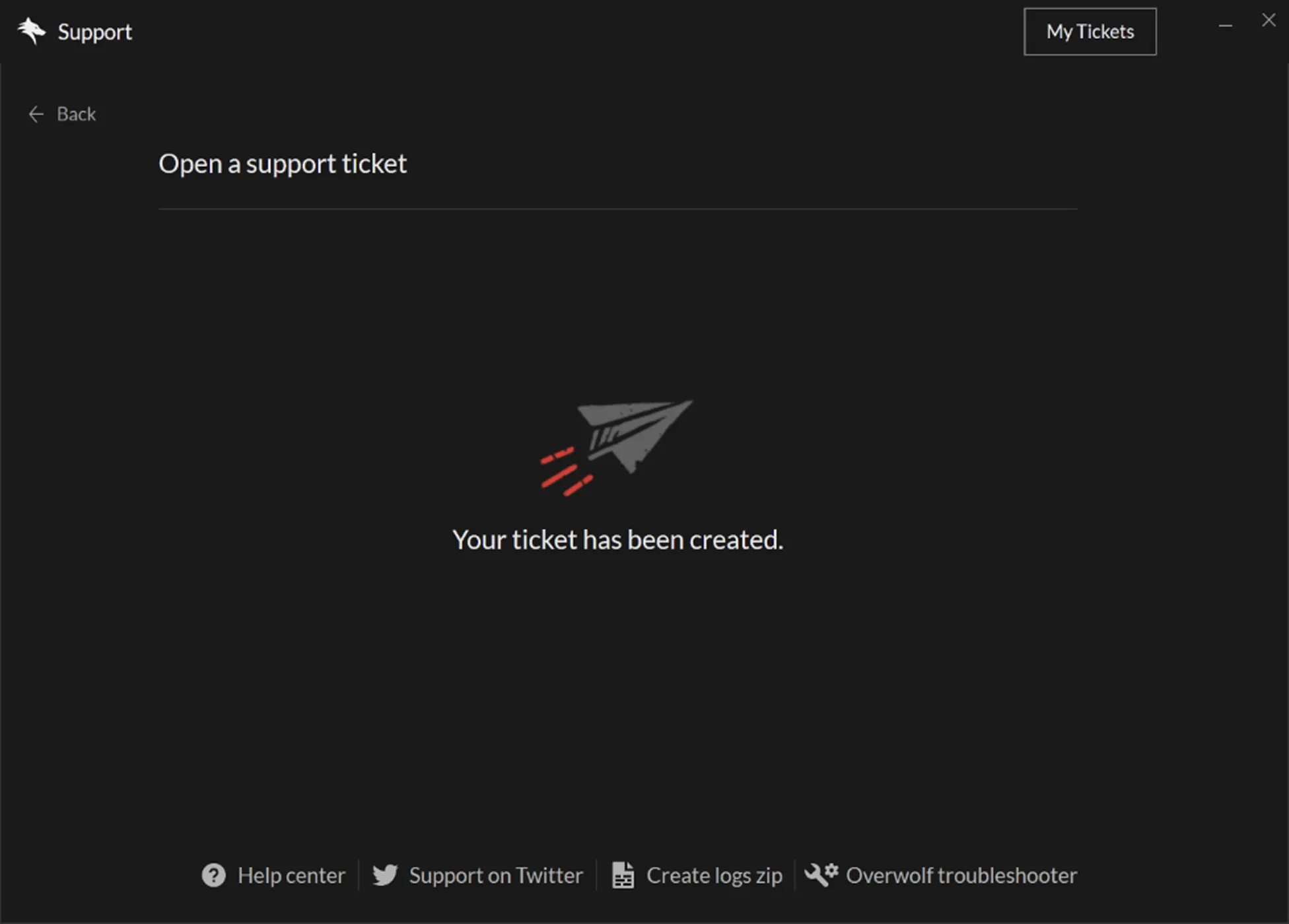
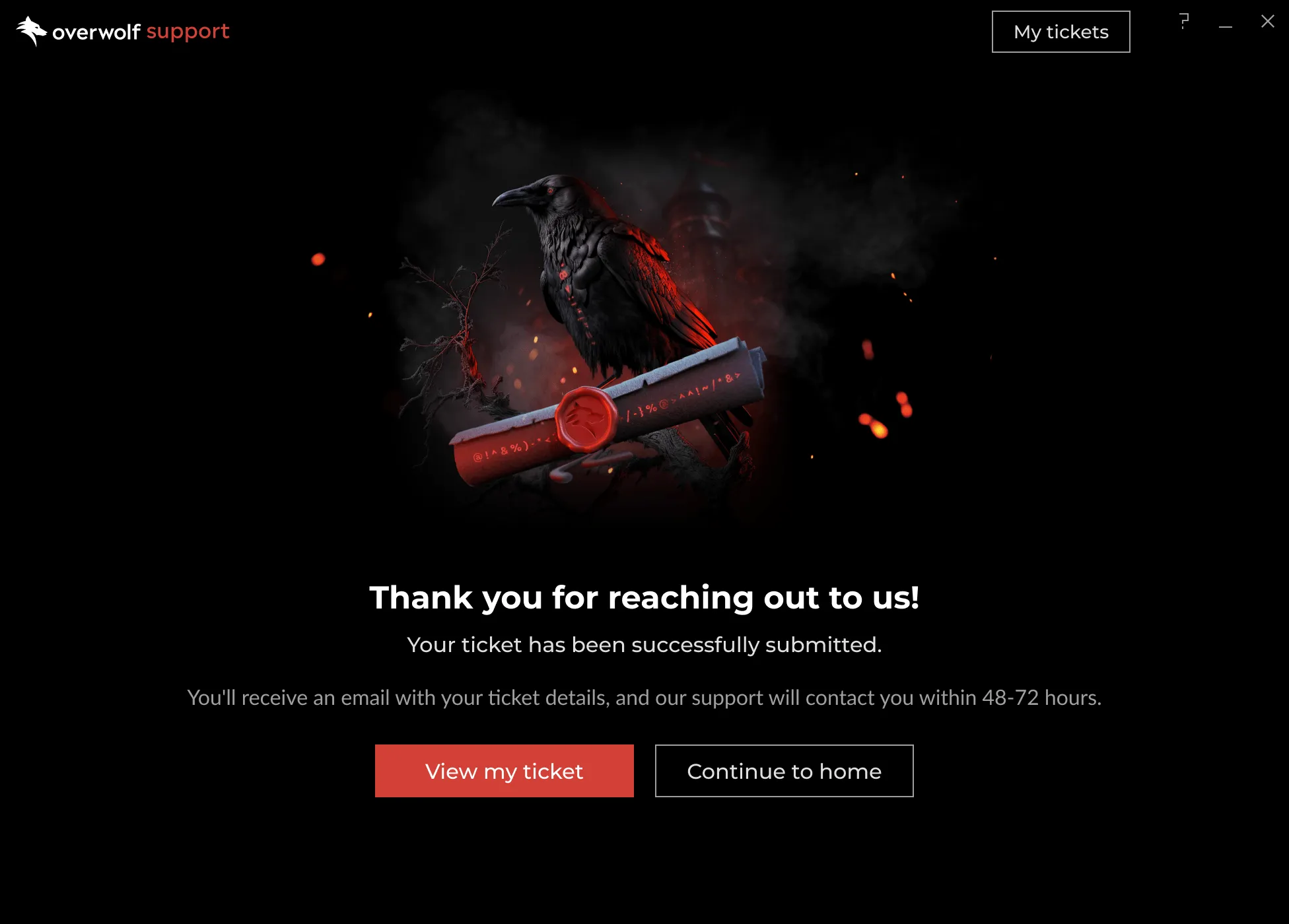
I redesigned the confirmation screen to include expected response times and clear next steps, so submission felt like the start of a process rather than a dead end.
Redesign the Open Ticket Page around conversation, not data exposure
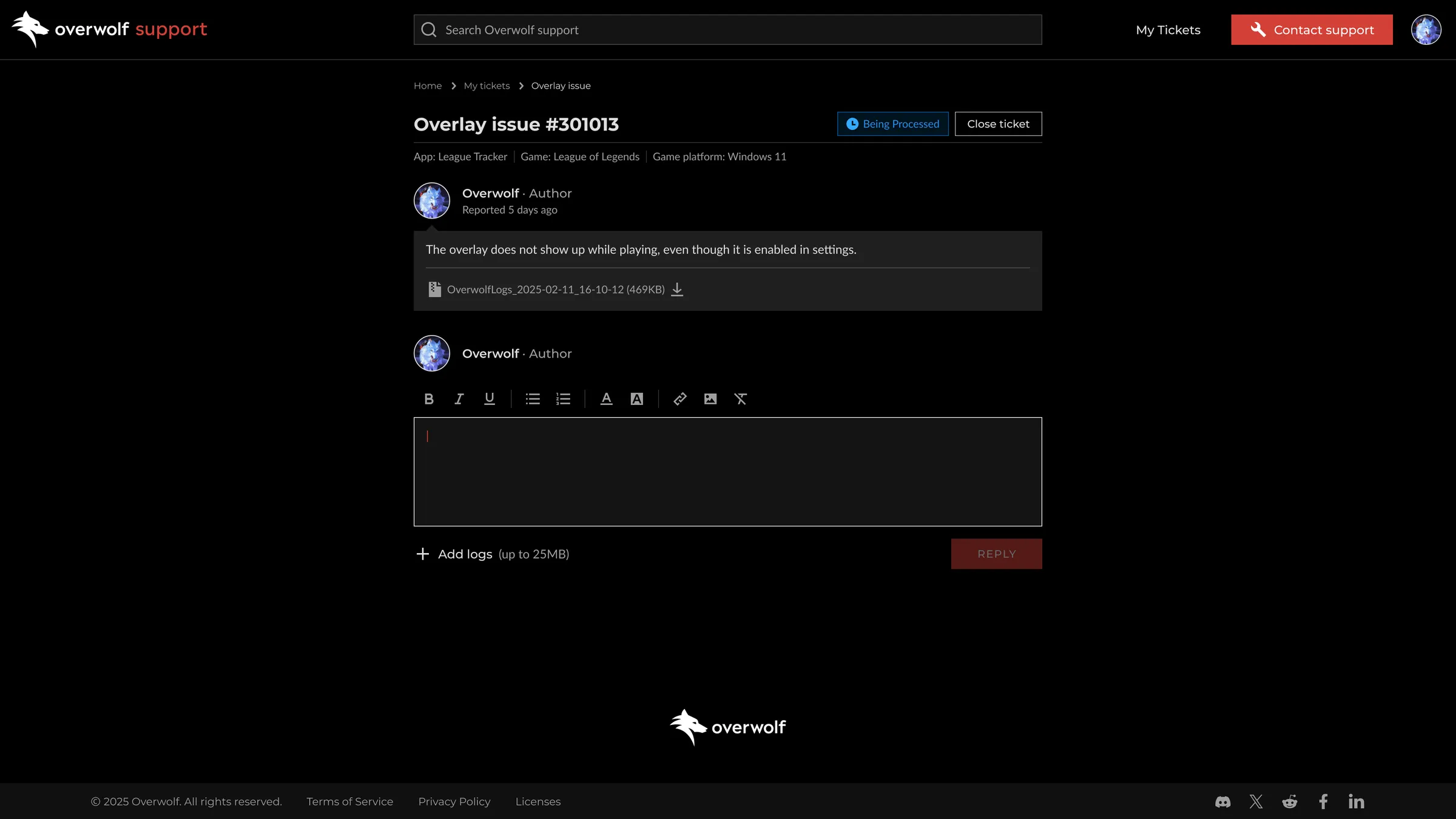
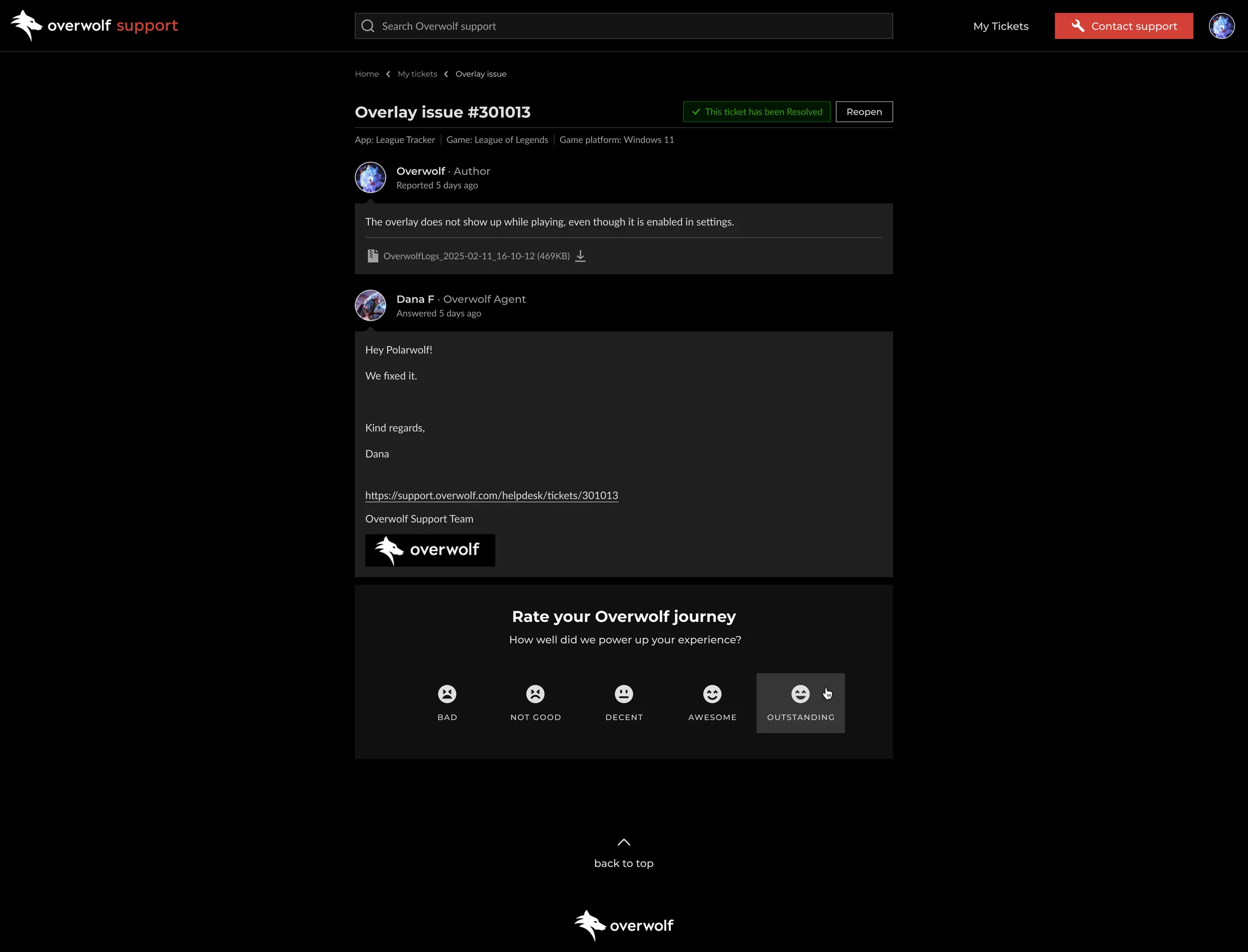
The Open Ticket Page was the clearest expression of the portal’s core failure: it exposed everything and prioritized nothing.
I redesigned the page to focus on a single primary task: continuing the conversation. The ticket thread is now the central hub, with the reply editor directly linked to it.
Mobile adaptation across all pages
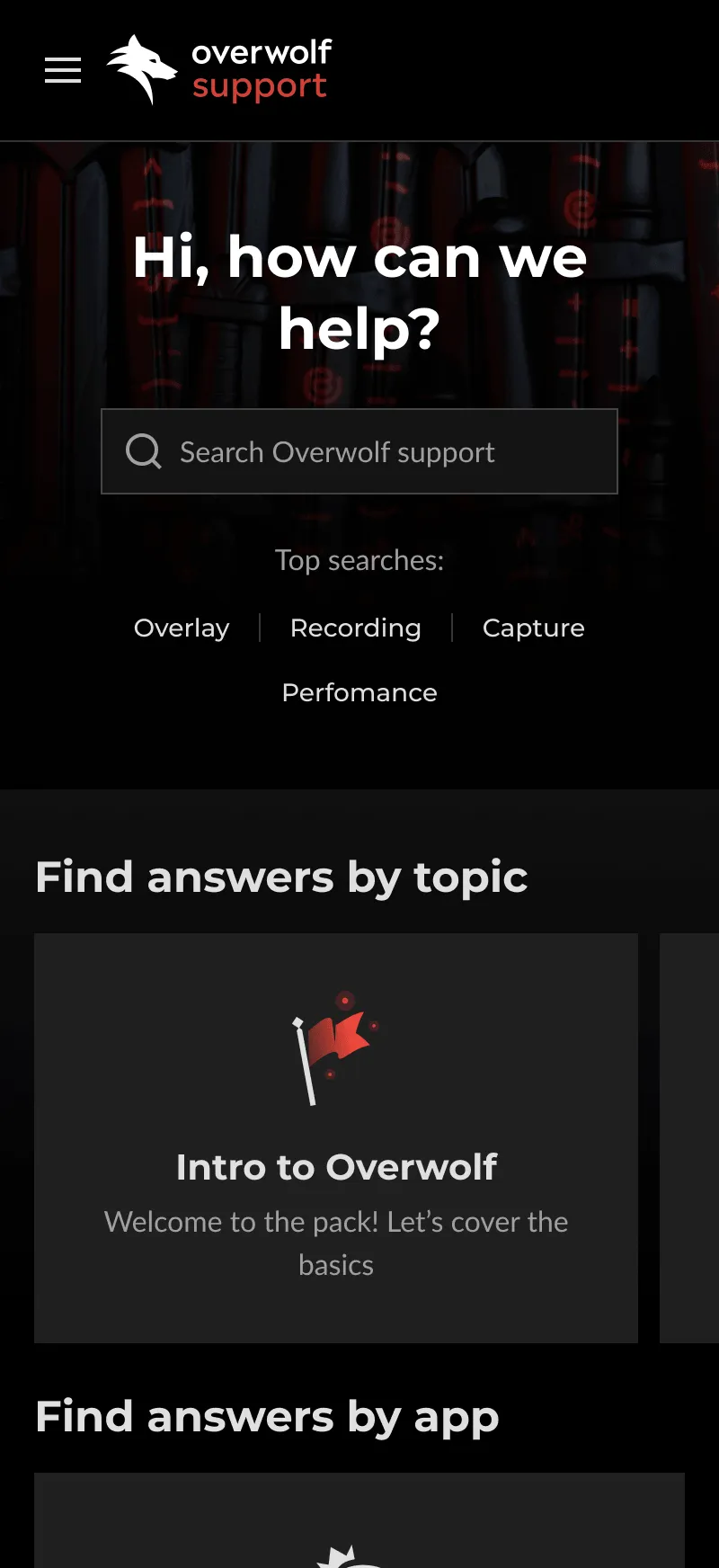
The redesign covered desktop and mobile from the start. All pages were adapted for mobile via responsive layout adjustments, with separate mobile-specific designs where the layout required.


Extend the redesign to where 88% of users start
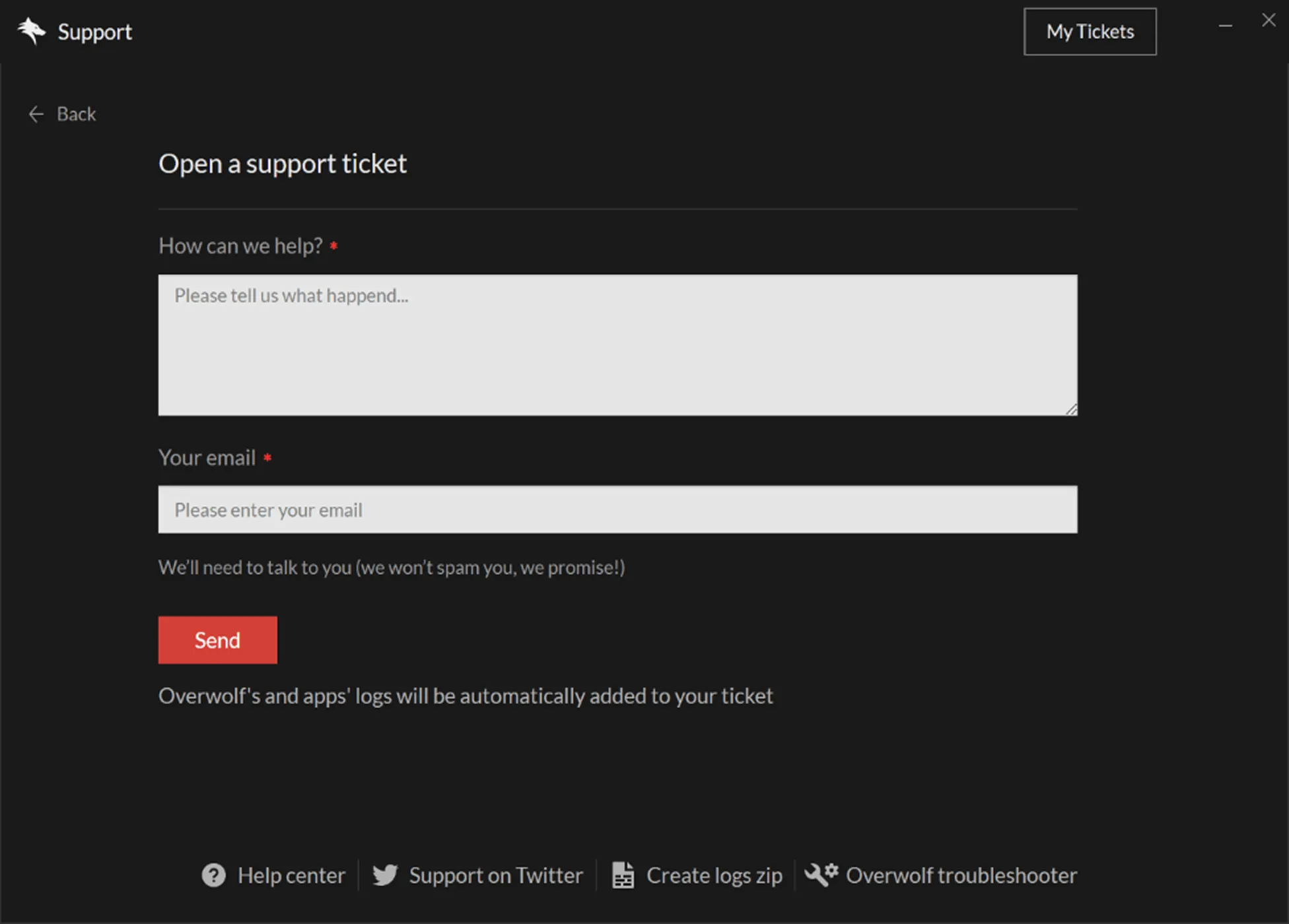
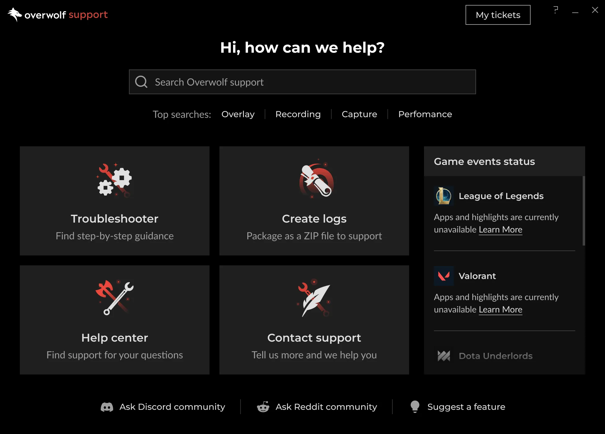
Because 88% of users start in the Overwolf client rather than the browser portal, redesigning only the portal would have missed the primary support surface. I extended the same routing and information architecture to the in-client support widget, keeping the experience consistent across touchpoints.
I also developed a design-system extension to maintain alignment as portal and product patterns evolved.
Old In-client widget

New In-client widget
Results
The numbers
Self-service success rate
+19pp
Ticket form completion
+15pp
Ticket volume
−23%
In-client widget usage
+47%
Guardrails held
Portal sessions remained flat, indicating that the 23% drop in tickets was due to improved resolution rather than deflection.
The redesign reduced support load without reducing engagement
Fewer tickets and better diagnostic information meant the support team spent less time on follow-ups and more time resolving issues.
The 23% reduction in ticket volume was not due to lower portal usage. Session numbers remained steady, while self-service success nearly doubled.
Agents received more complete requests from users who did submit, shortening the follow-up-to-resolution cycle, a known cost driver.
The rise in in-client widget engagement (+47% unique openers) suggests the consistency investment was effective. Users who reached out for support through the Overwolf client were more engaged.
How we know
Ticket volume and form completion were measured directly in Freshdesk and Google Analytics over the six-month post-launch period.
Self-service success rate definition: sessions that included search or article engagement but did not result in a ticket submission within the same session.
Two supporting data points are noteworthy, with appropriate caveats:
- 18% of users who saw the “These resources can be helpful” panel clicked through to an article, and this was correlated with lower ticket submission rates in those sessions.
- An audit of 30 Freshdesk tickets from the measurement period showed that log-missing submissions dropped from ~30% to ~15%.
No A/B test was conducted. Attribution relies on rollout timing and change ownership. The consistent session count, along with a decrease in tickets, suggests improved resolution rather than deflection.
“Users come more prepared, so we can start solving instead of asking questions.”
Or ManorHead of Support & IT

How the work spread
The in-client widget redesign extended the same routing and information architecture patterns to the Overwolf client, reaching 88% of users who access support outside the portal.
The design-system extension I developed keeps portal and product surfaces aligned as both evolve, removing the need for per-release design reconciliation.
Reflection
What I’d do differently
The “These resources can be helpful” feature posed the highest risk in the redesign. It was a Freshdesk workaround without a native equivalent, added at the most critical step of the flow.
We launched it in full rather than phasing it. In hindsight, I’d roll it out to 50% of users first or run a proper A/B test.
The correlation data we have is directional. With a controlled split, we’d know exactly how much self-service lift it’s responsible for versus the lift from the homepage and form changes.
What I took from this
- Moderated sessions with users revealed what satisfaction scores missed.
- When constraints rule out the ideal fix, a measurable and extensible workaround is more valuable than waiting.