Three product domains at Overwolf repeatedly recreated similar components, and hybrid pages that combined product and marketing lacked a shared token vocabulary. I co-led the foundation, defining tokens, color, typography, grids, and reusable components so teams could build consistently across 17 products and 4 brands.
System scope
Core + Semantic Tokens
168 + 157
Platforms × Modes
4 × 2
Products across 3 domains
17
Operational effect
- One shared core token vocabulary across all products.
- Phased rollout that preserved user predictability.
- Faster shipping for web teams. Observed qualitatively, not instrumented.
- Adoption beyond web products remained partial due to constraints in the development environments.
Project Snapshot
- Timeline
- Tokens and foundations from January to July 2024, then components and rollout from July 2024 to July 2025. Adoption ongoing
- Role
- Senior Product Designer (co-owner of the shared foundation layer)
- Team
- Co-led the foundation with an Art Director (visual direction) and an Engineer (token implementation)
- My ownership
- Token architecture, including all 168 core and 157 semantic tokens, the semantic layer for hybrid product and marketing contexts, the Apps Platform component and template refactor, and the spreadsheet handoff model.
- Platform
- Marketing Web (desktop & mobile) / Apps Platform Web (desktop & mobile), Console (desktop & mobile), Client (desktop) / CurseForge Web (desktop & mobile), Consoles (desktop & mobile), App (desktop)
- Users
- Marketing & Product Designers, Engineers
Challenge
Three design languages across one company
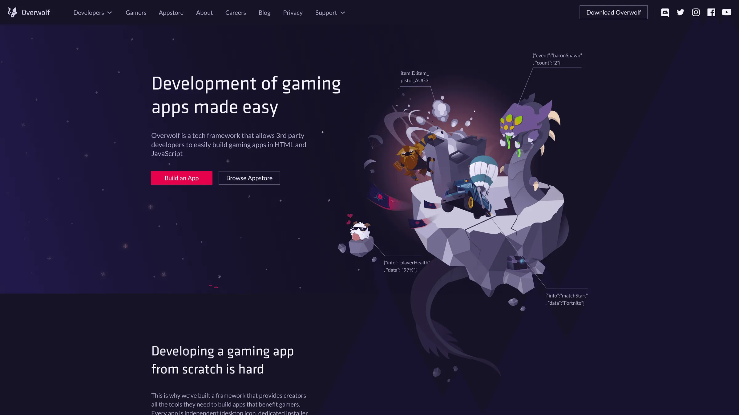
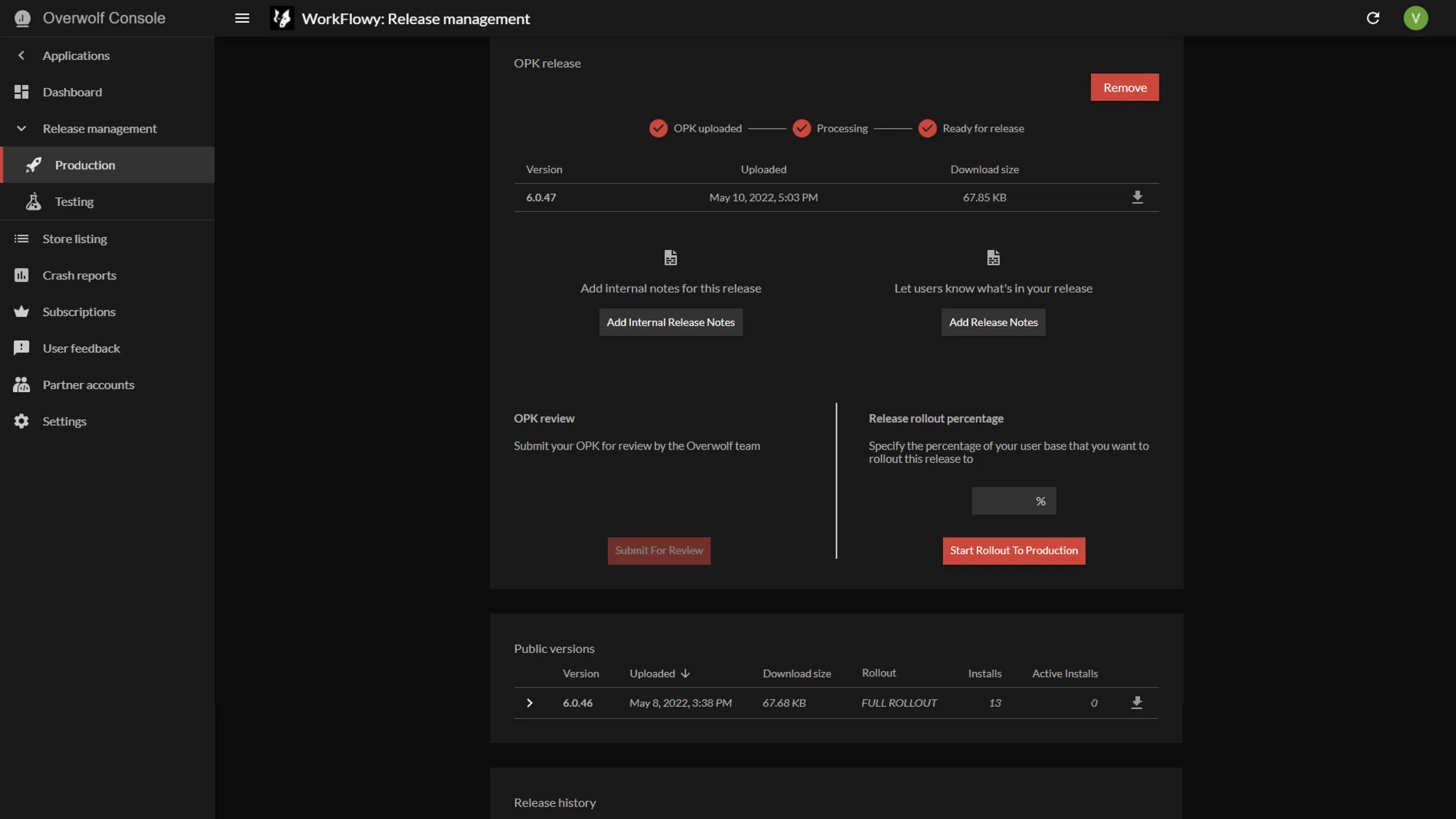
Marketing sites, the Apps Platform, and CurseForge products each maintained their own visual systems. Gamers moving between the Overwolf client, the App Store, and the CurseForge mod pages encountered three distinct products.
“Products started to feel like separate entities across platforms, with inconsistent visual and interaction patterns.”
Alon RabinovitzCPO

Teams repeatedly rebuilt the same components across products, yet no one truly owned them. Legacy gray palettes varied across domains. Hybrid pages lacked a shared vocabulary across marketing and product contexts, and engineers working in different environments translated custom designs into ad hoc code.
When a new Art Director arrived with a plan to refresh the brand, there was no system in place to support it. Overwolf’s design principles provided alignment vocabulary, but the underlying structural foundation was missing.
Old Overwolf Homepage
Old CurseForge Console
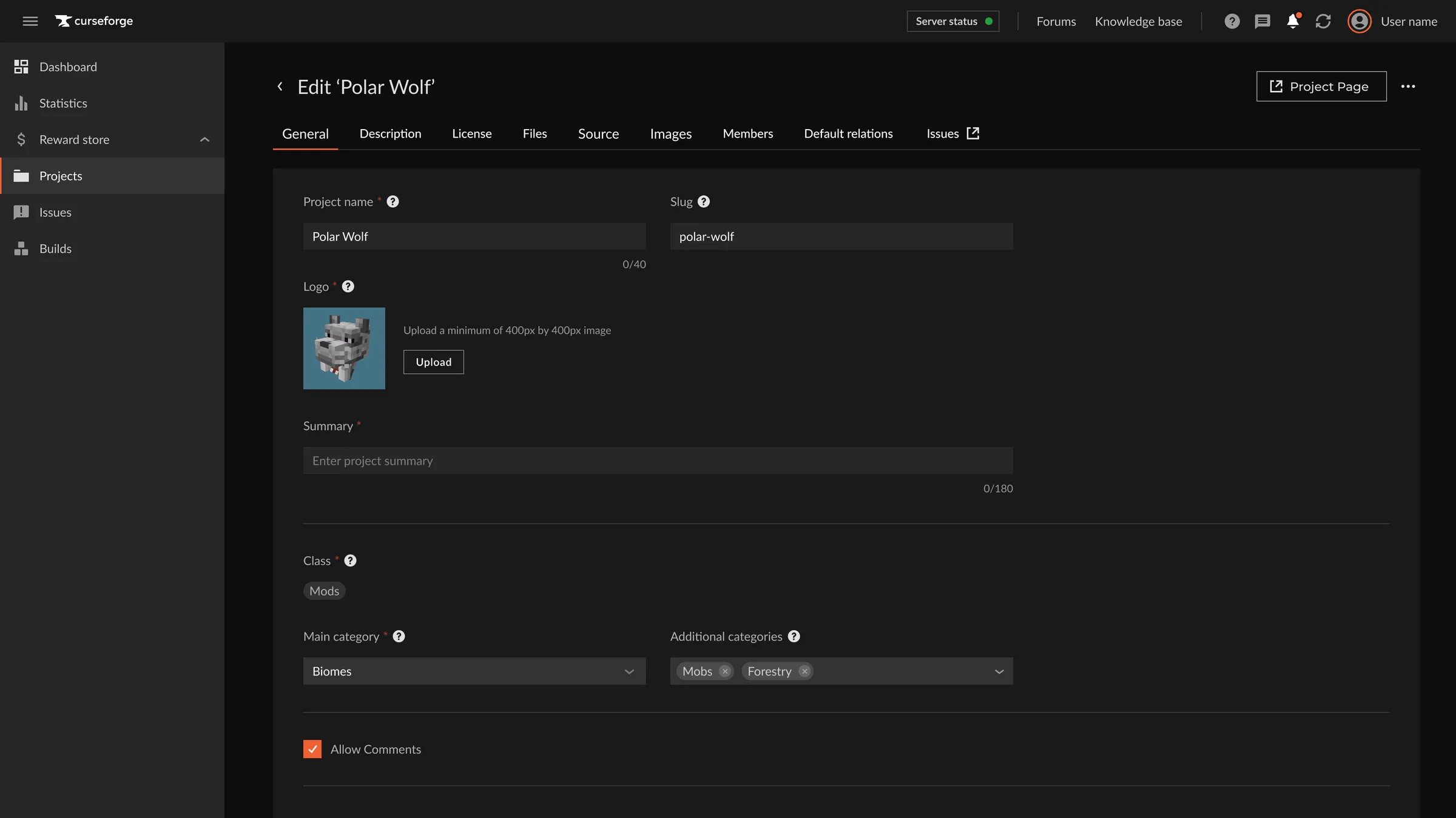
Old Overwolf Console
What I couldn’t change, and what I had to protect
Hybrid products
Some products combine marketing and product components on the same page, so the semantic layer needs to serve both contexts from a single source.
Different development environments
Because products use different technology stacks, the token system needed to be universally compatible.
Guardrail
Users shouldn’t feel they’re using a different product overnight.
Where we started
No shared tokens existed. Each domain maintained its own colors, typography, and components, and there was no instrumentation to measure design velocity, adoption, or consistency. That gap ended up mattering, and I’ll come back to it.
DESIGN TOKENS
0
Discovery
Benchmarks pointed to one recurring pattern
Before making any changes, I reviewed Material Design, Atlassian, Polaris, Fluent, Carbon, eBay Playbook, Ant Design, Vibe, and the W3C token standards. My central question was how to build a system that could serve multiple products without becoming either overly rigid or overly fragmented.
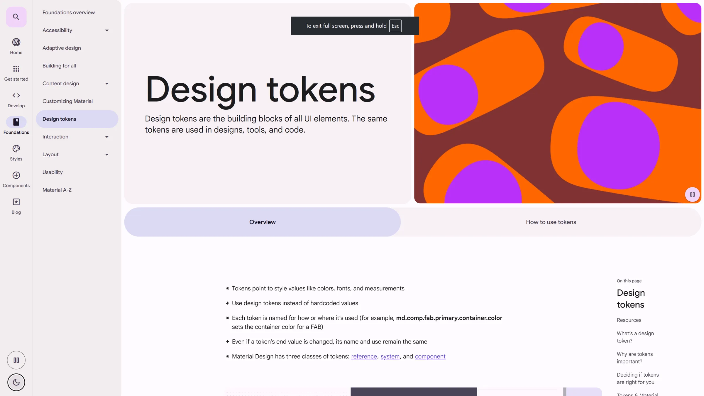
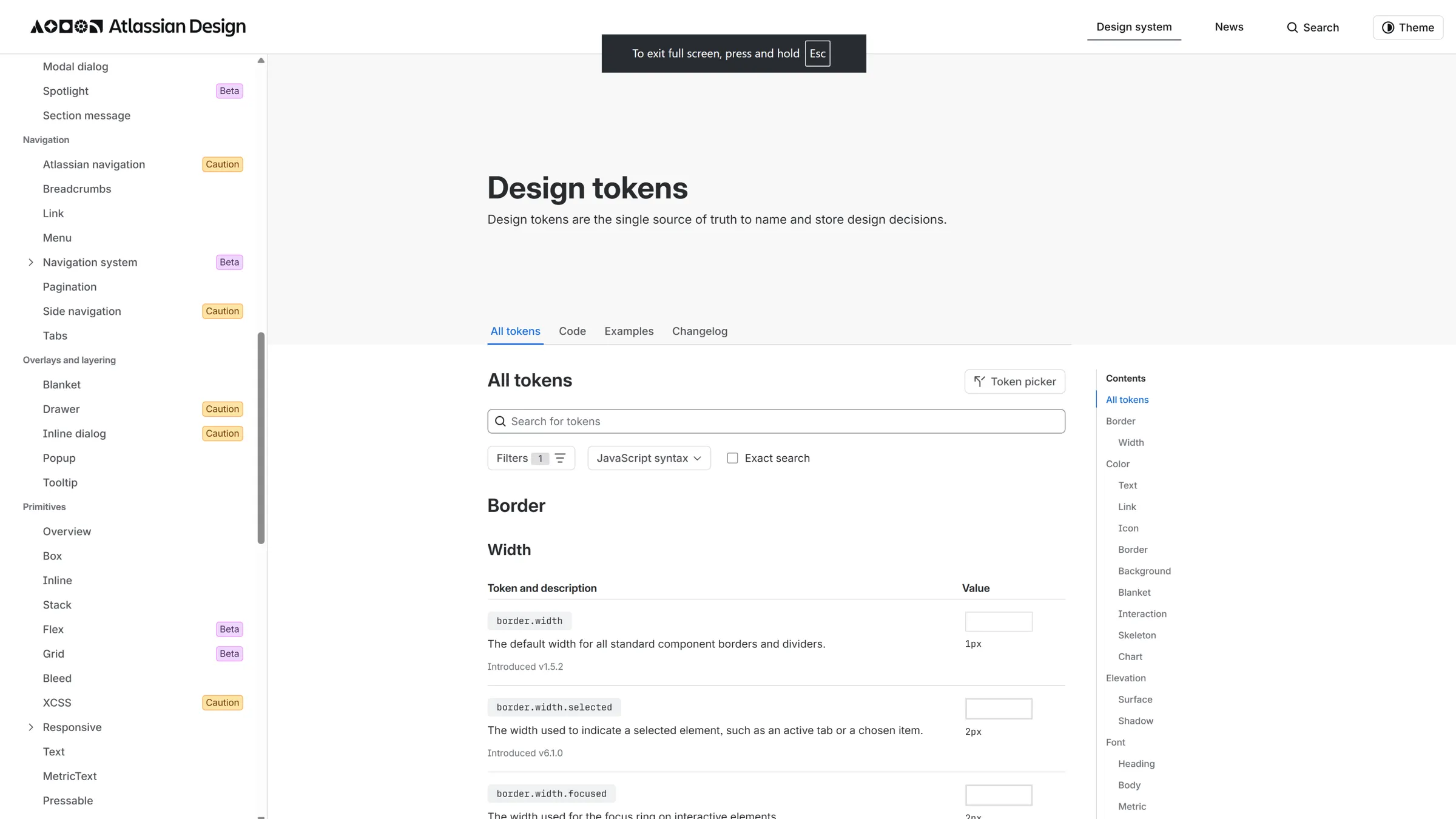
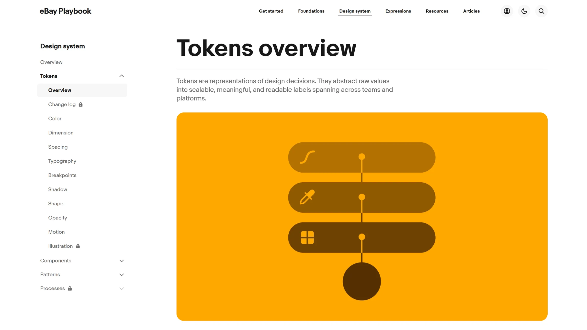
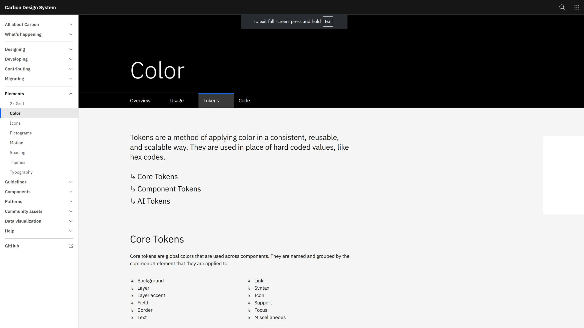
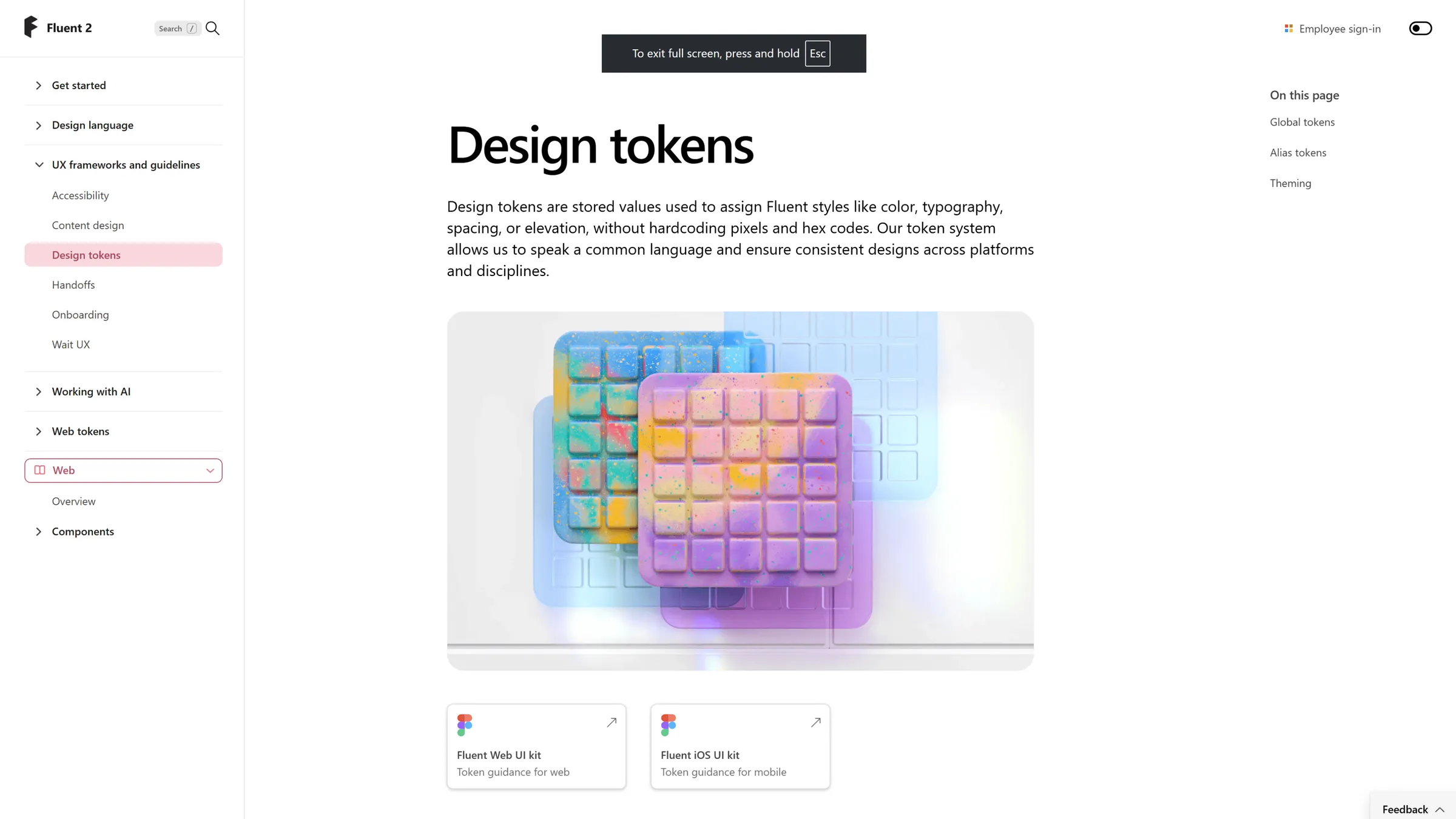
The benchmarks converged on a recurring pattern, a Core primitive layer feeding a Semantic layer, sometimes with Component tokens above it. They handled product surfaces well.


The hybrid marketing and product context that reshaped the architecture
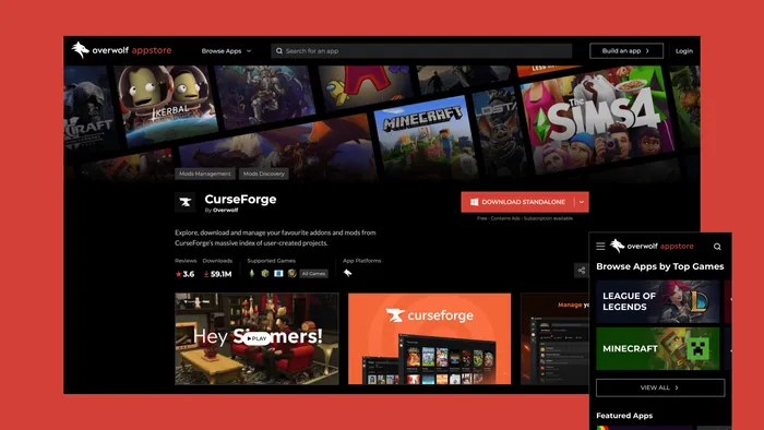
For example, the constraint surfaced in the App Store. A single product detail page featured a promotional hero and media assets at the top and an app review functionality below the fold. Promotional and functional content share a single frame. Other products did the same combination.
This wasn’t named in the original specifications. It emerged from analyzing legacy library files, real product pages, and team feedback, and it reshaped every decision below.
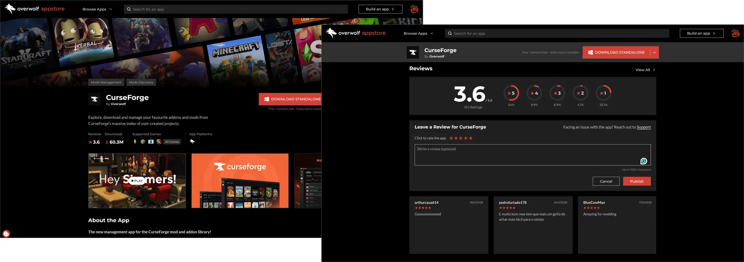
Separating marketing and product semantics would force context switching in hybrid files and create parallel systems indefinitely.
Solution
Build what serves the team now
These decisions all trace back to the same gap, the absence of a shared foundation, and each addresses it from a different angle: architecture, alignment, a context-aware semantic layer, and handoff.
While tokens provided the architectural framework, the foundation also includes palettes, typography, icons, components, templates, grids, and a knowledge session to support adoption. The decisions below shaped all subsequent elements.
Ship two tiers, not three
The question was not whether a three-tier architecture (Core, Semantic, Component) is theoretically superior, as it is in a mature system. Instead, we needed to determine whether it is the best choice for our current needs.
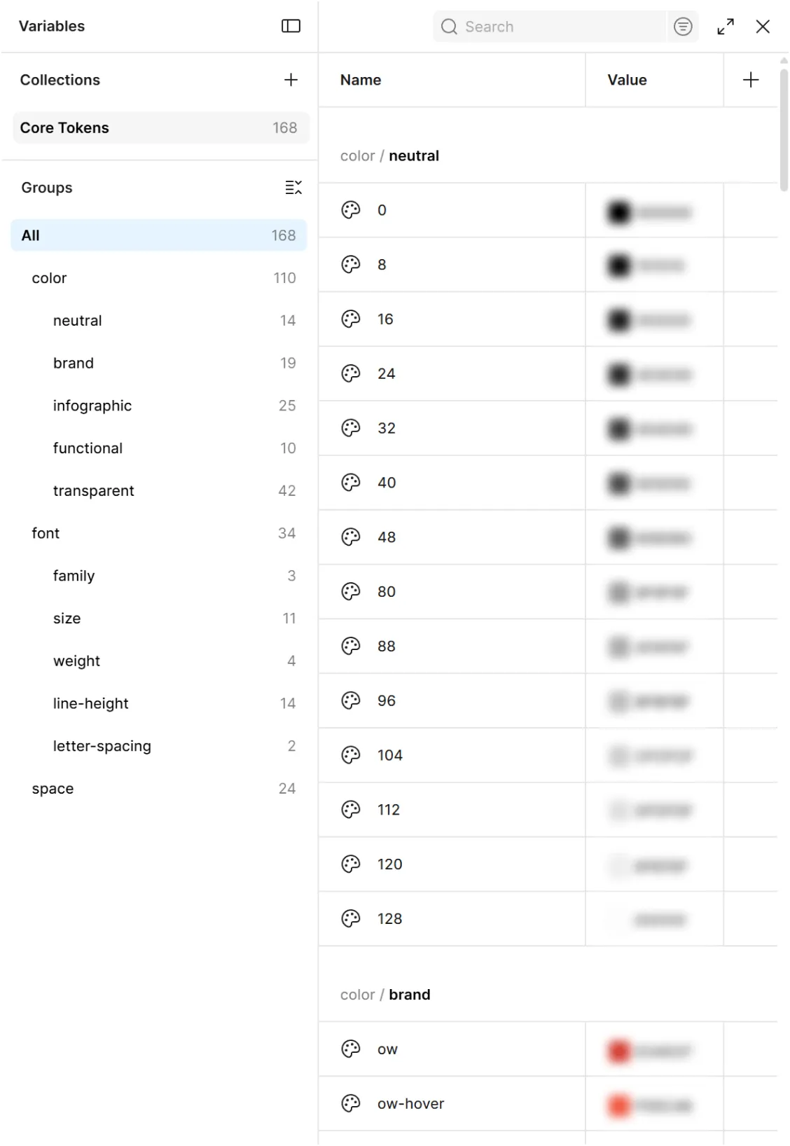
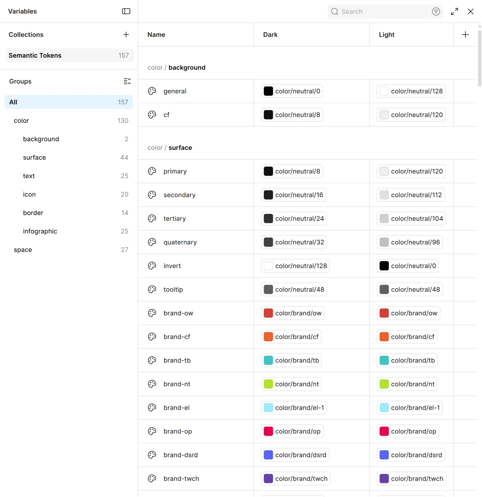
I selected a two-tier structure: Core (168 primitive tokens) and Semantic (157 context-aware tokens used directly by components). I presented the three-tier model during the knowledge session for conceptual clarity, but did not implement it.
Component tokens add an additional layer for designers and engineers to manage. At that stage, introducing a third tier would have been premature and would have increased daily complexity without immediate value.
Core tokens tier (168 primitive tokens)
Semantic tokens tier (157 context-aware tokens)
I chose the simplest architecture that matched the team’s current needs.
Three legacy gray palettes became one
Each domain, including Marketing, Apps Platform, and CurseForge, maintained its own gray palette. This led to different hex values for similar neutrals and inconsistent Dark and Light coverage across products.
I consolidated them into a single Gray scheme: 17 neutral grays stepping from neutral/0 (#FFFFFF) to neutral/128 (#000000) in 16-unit intervals, and adapted it to 14 for both Marketing and product. Each neutral was converted into a token that resolved to Light and Dark mode values through the semantic layer.
The trade-off was that some domains lost neutrals they were used to. Mapping every legacy gray onto the shared 16-unit scale meant a few old values shifted to the nearest step rather than carrying over exactly.
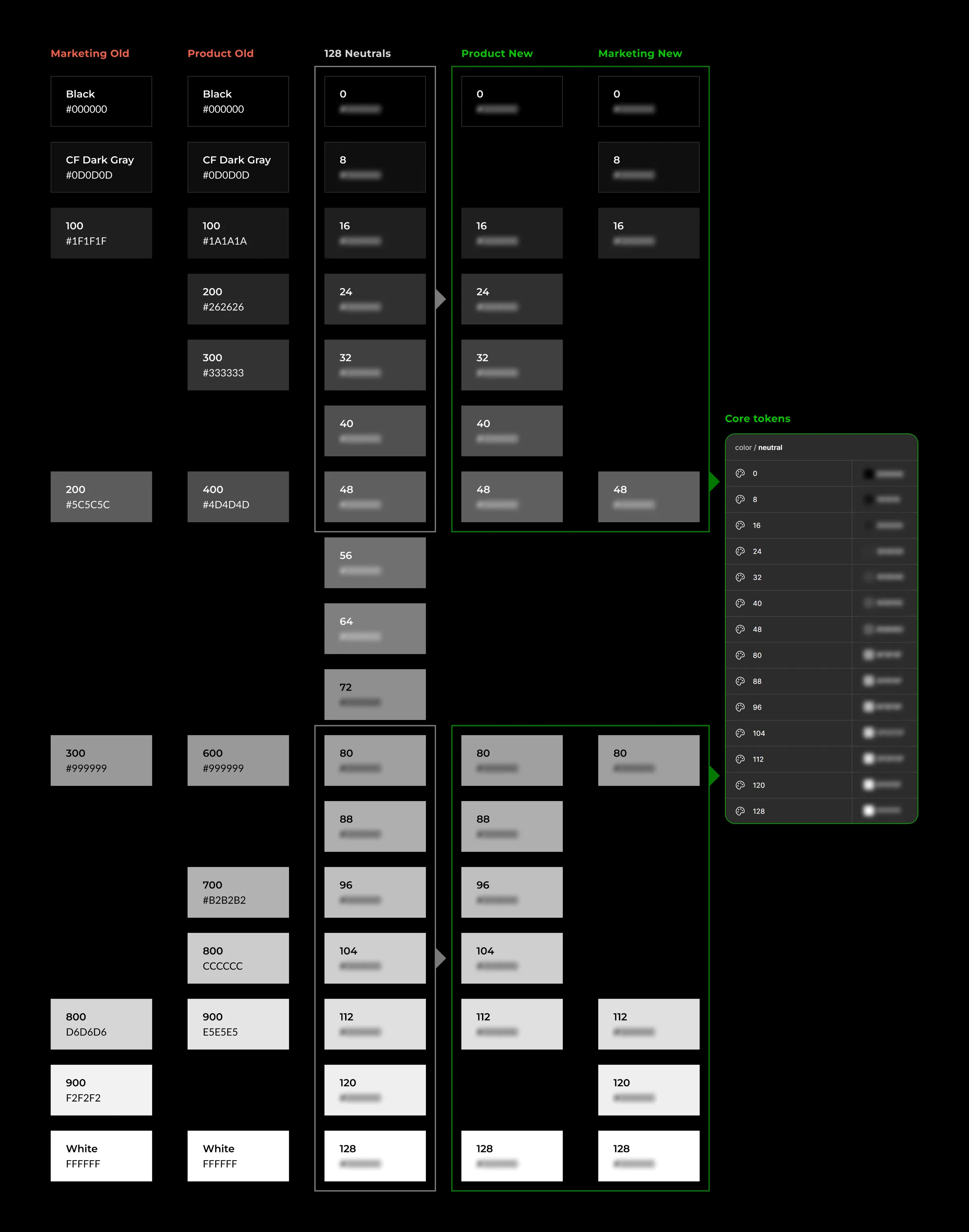
Building the semantic layer during consolidation allowed products to avoid duplicate migration costs. As each product adopted the new tokens, the unified Gray scheme was implemented. The two-tier architecture supported consolidation without requiring remapping for each product.
One shared gray scheme reduced duplication and made consistency scalable across products.
Let the semantic layer serve both product and marketing
The hybrid-context constraint revealed two options. Product-only semantic tokens would force marketing components into one-off styling. Separate semantic layers would require designers to switch contexts mid-file on every hybrid page and maintain parallel systems indefinitely.
I built a single semantic layer that resolves correctly in both contexts. --color-surface-brand-ow returns the correct Overwolf red in both a CTA button and a hero banner, and --color-text-primary works in a data table and a marketing paragraph. All four platforms (Overwolf, CurseForge, Tebex, and Nitropay) have brand token families that resolve through the same layer.
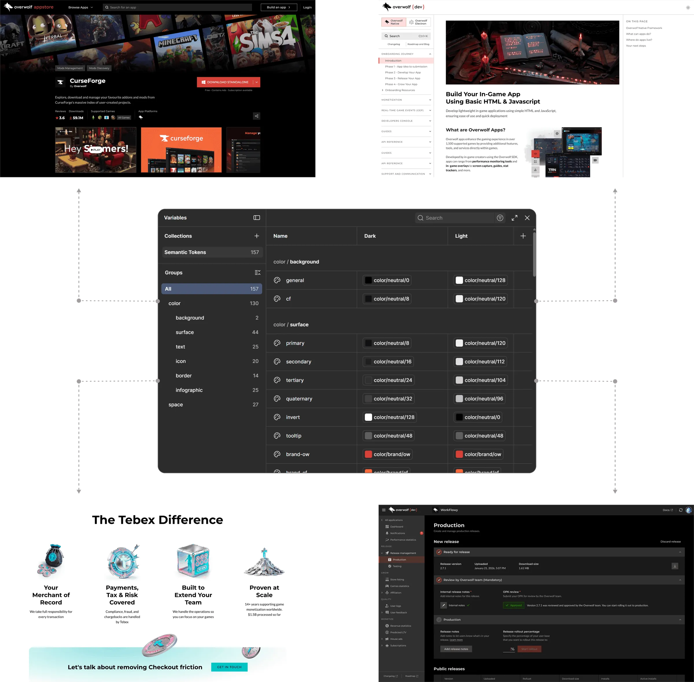
I built one shared semantic layer instead of fragmented parallel systems.
Hand off through a spreadsheet, not a pipeline
“Different development environments” meant we couldn’t assume every team could use a modern token pipeline. A Style Dictionary setup or a Figma Tokens plugin would have been cleaner for the web, but would have delivered no value to the desktop client or to consoles built on the React admin framework.
I created a Google Sheet listing each token name with its Light and Dark hex values. Web developers could copy these into CSS custom properties, while non-web teams used the sheet as a shared reference, even if their technology limited full implementation.
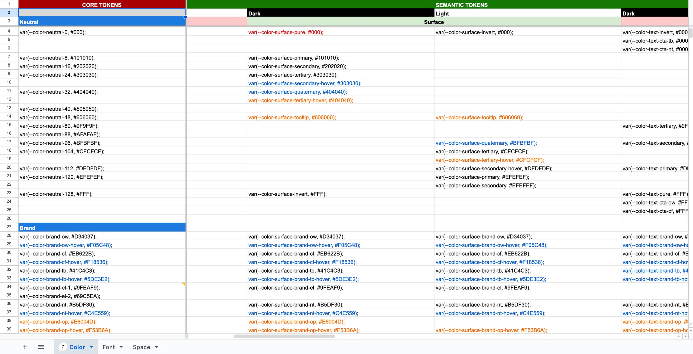
Adoption mattered more than technical elegance. I chose a handoff every team could actually use.
Results
What shipped, verified at source
Core primitive tokens
168
Semantic tokens
157
Platform brand families
4
Products across 3 domains
17
The foundation was more than tokens
Color palettes
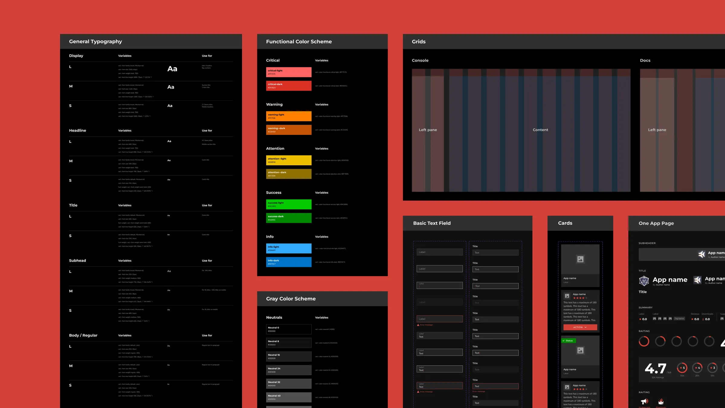
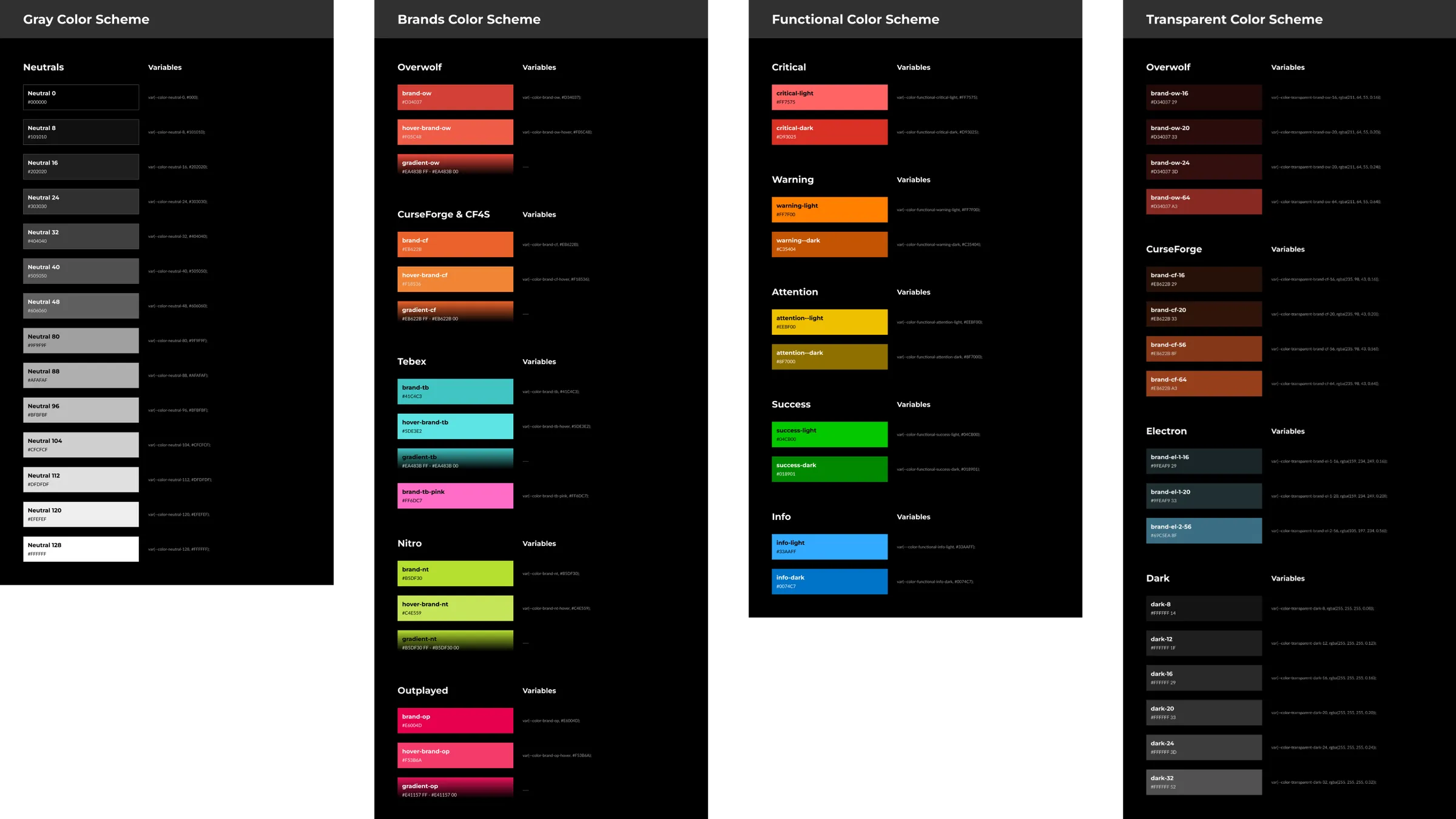
Four schemes define the color system. Gray includes 17 neutrals from neutral/0 to neutral/128. Brands covers the platform families (Overwolf, CurseForge, Tebex, and Nitropay), each with hover and gradient variants. Functional handles Critical, Warning, Attention, Success, and Info. Transparent provides alpha-stepped overlays for brand and dark surfaces. Every value resolves to Light and Dark through the semantic layer, so a palette change never affects a component.

Typography system
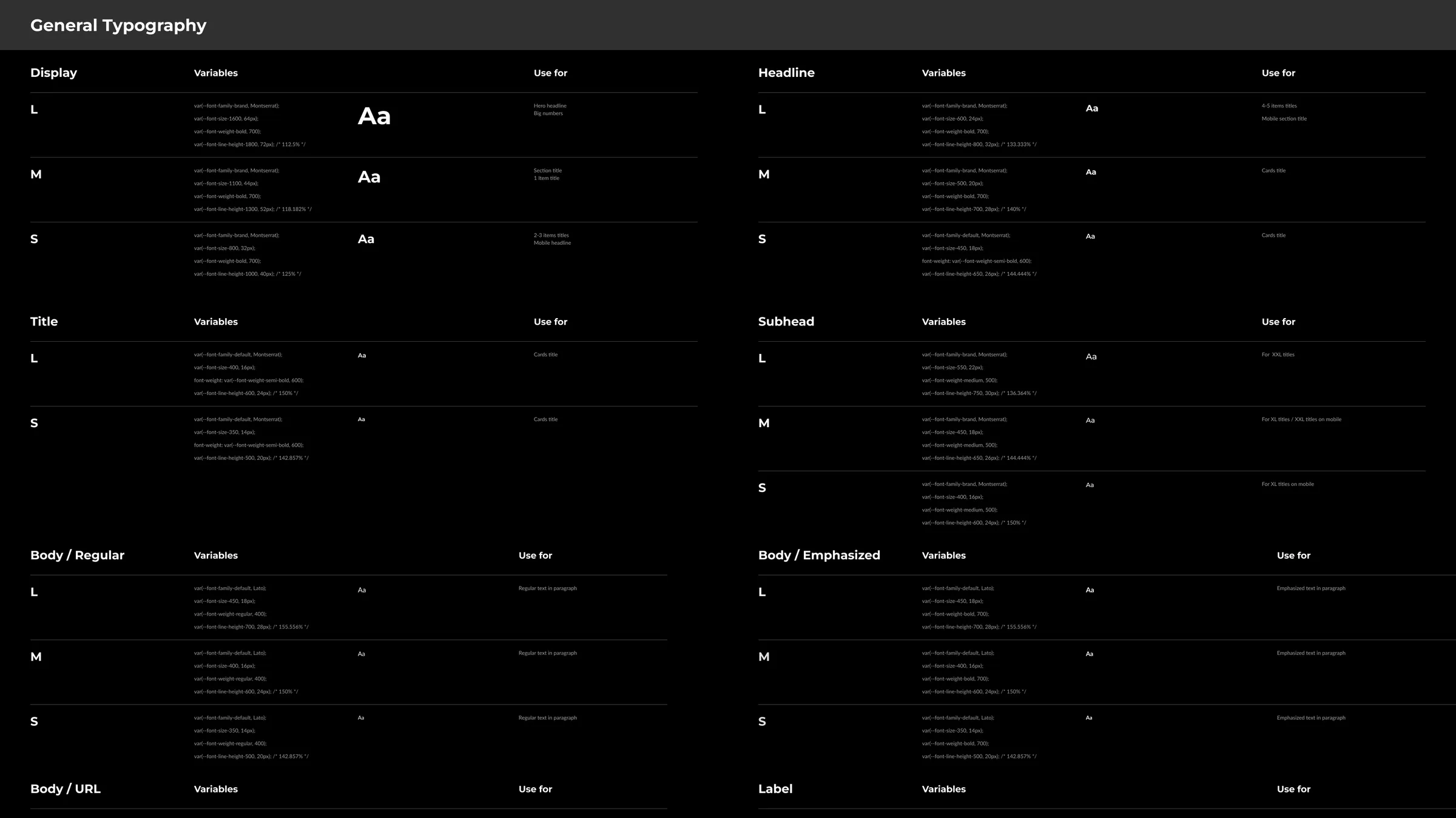
Two type families split the work. Montserrat supports the following brand and structural types: Display, Headline, Title, and Subhead. Lato supports the following reading types: Body Regular, Body Emphasized, Body URL, and Label. Each step ships as a variable with size, weight, and line height baked in, and the “Use for” column tells a designer where each one belongs, so they don’t have to guess.
Grid system
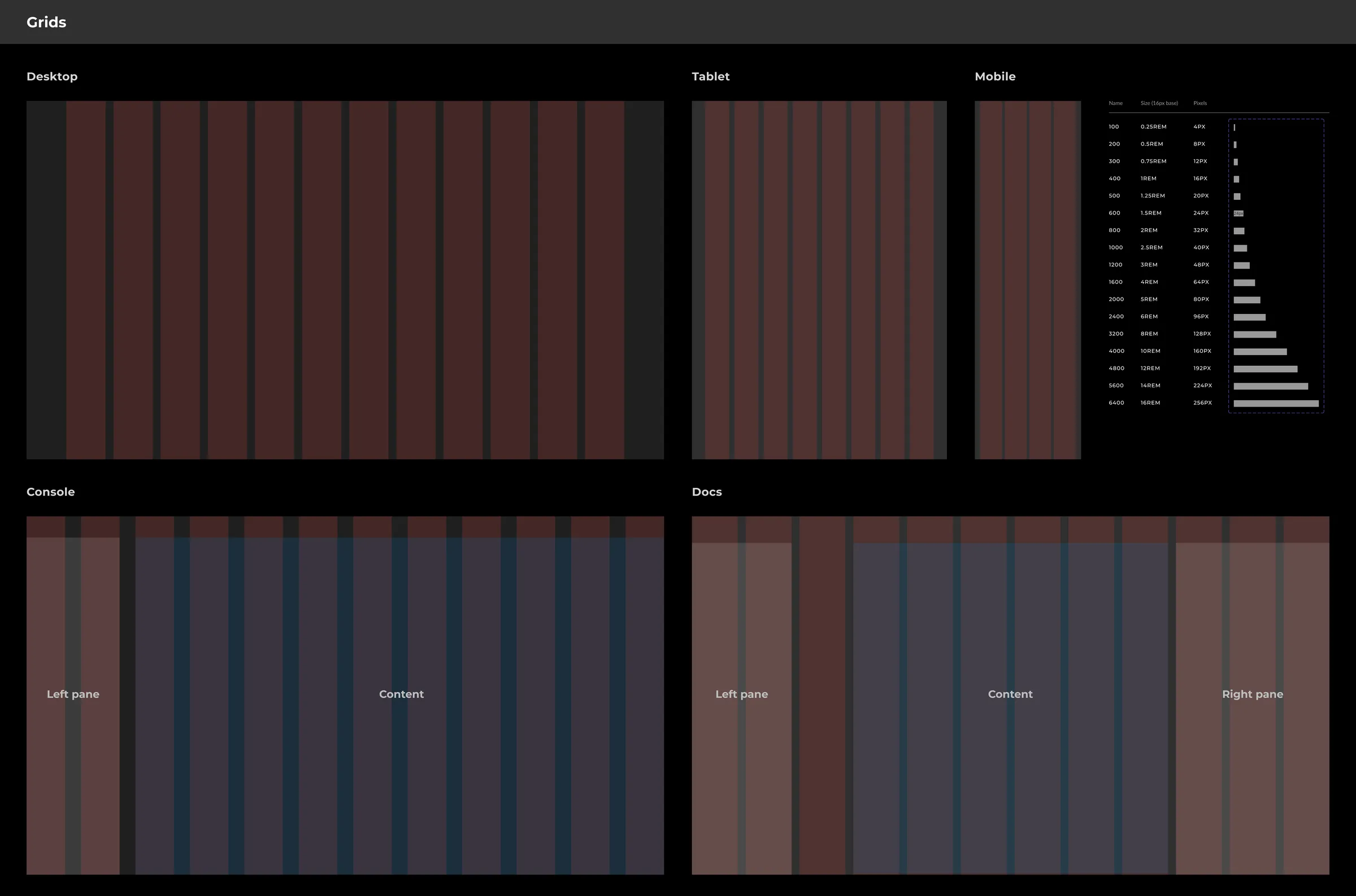
Five grid contexts, not one. Desktop, Tablet, and Mobile cover marketing and product pages. Console and Docs add the left-pane / content / right-pane structure that those surfaces need. A spacing scale from 4px to 256px (tokens 100 to 6400) feeds them all, so layout spacing pulls from the same source as everything else.
Component and template library refactor
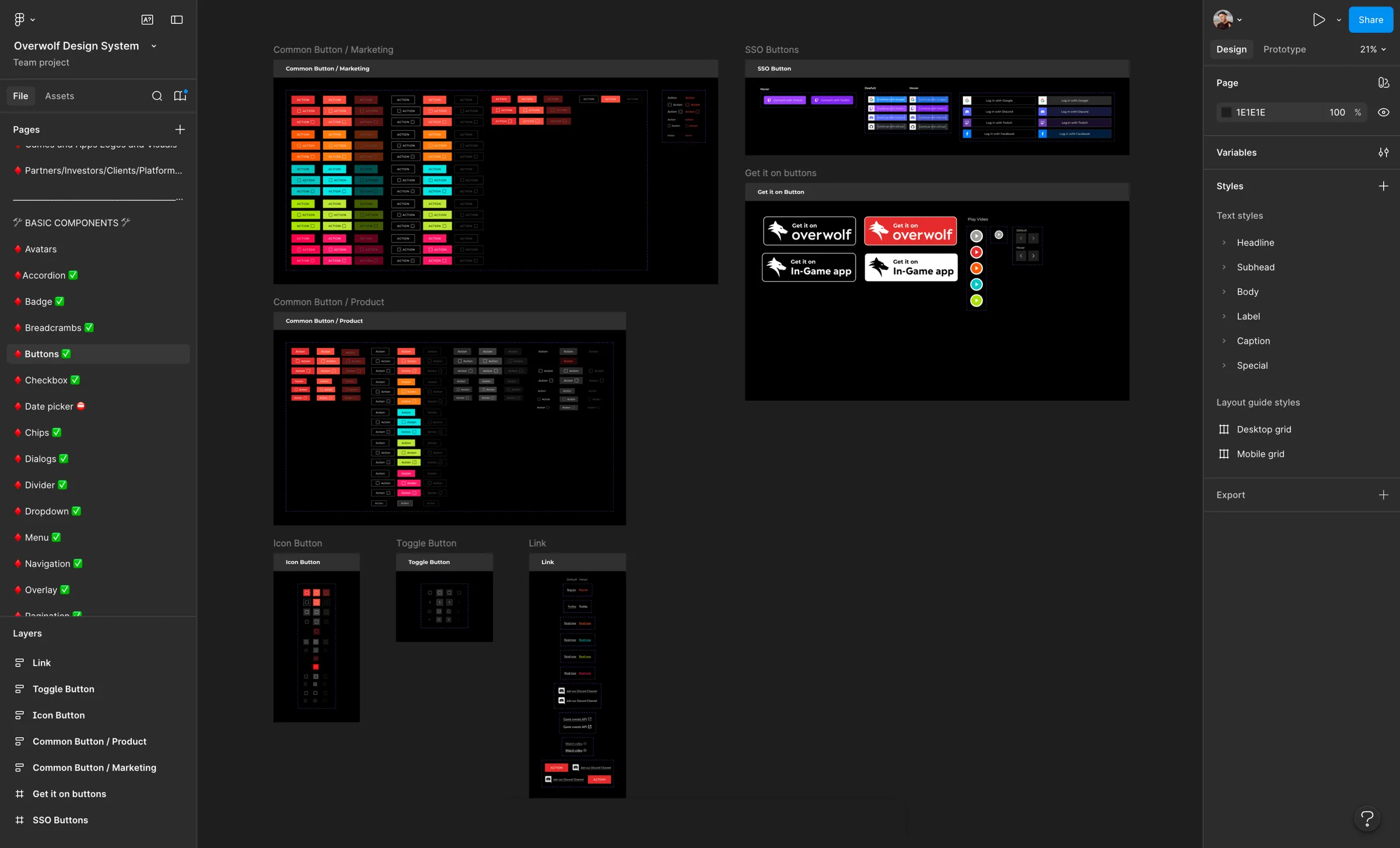
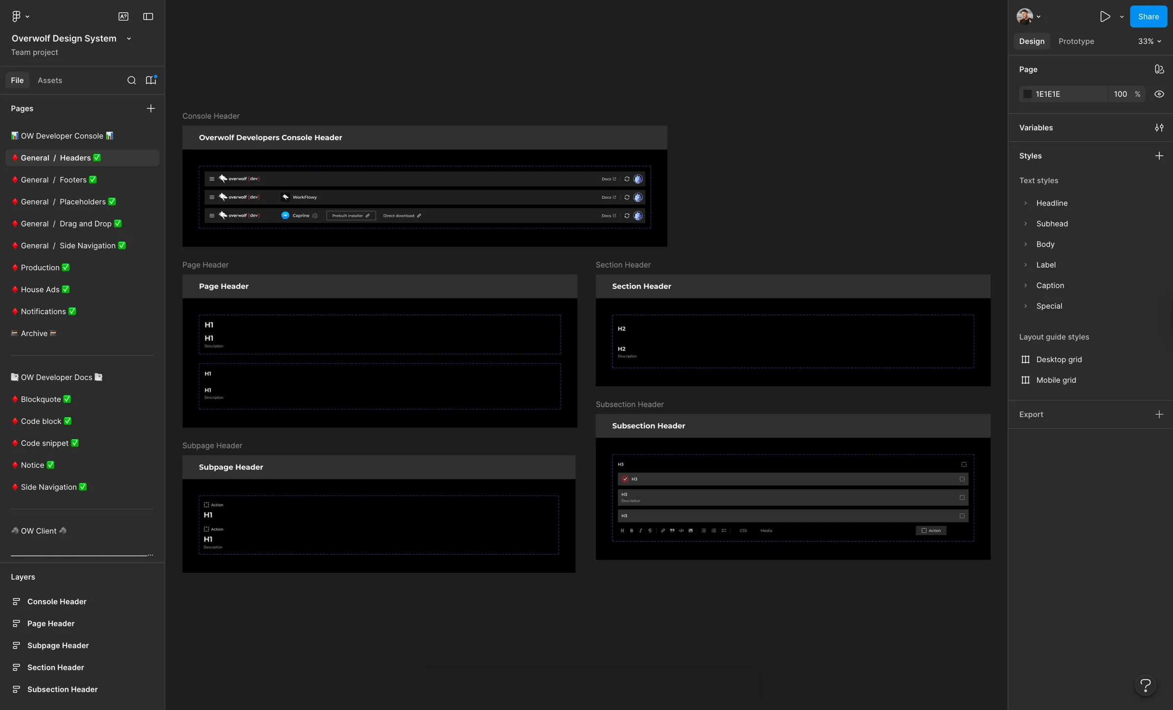
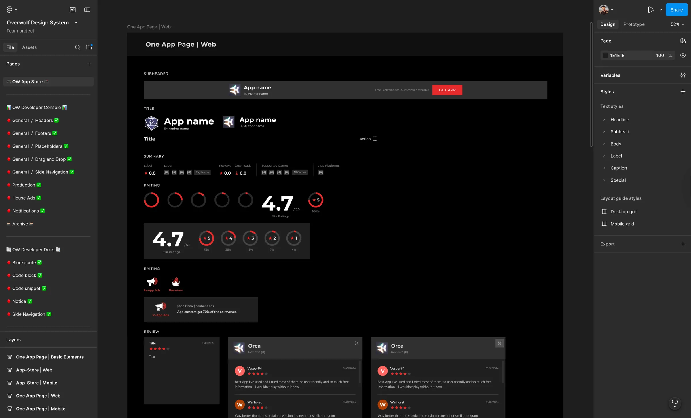
I rebuilt the Apps Platform component and template library using the new tokens. That covered buttons, headers, navigation, and the full set of basic components, culminating in a complete One App Page template for web and mobile. Marketing and product button variants live in the same library but resolve through the shared semantic layer, which kept the hybrid pages from splitting into two parallel sets.
Shared tokens turned brand alignment into default behavior
The system let Marketing roll out the brand refresh without product-by-product negotiation of visual direction. In the Apps Platform, the design of current and upcoming features benefits from using shared tokens rather than one-off styles.
Impact evidence is qualitative because baselines weren’t instrumented
Token counts were measured directly. The velocity claim is based on observation because no baseline was established at the project’s outset. No A/B test was conducted. Attribution is based on team feedback collected over six months.
“We can build and ship things faster than we used to.”
Miriam MoshinskyArt Director

“Tokens gave me a clear vocabulary for mapping designs to code, reducing one-off values and saving implementation time.”
Ben KorenFront End Developer

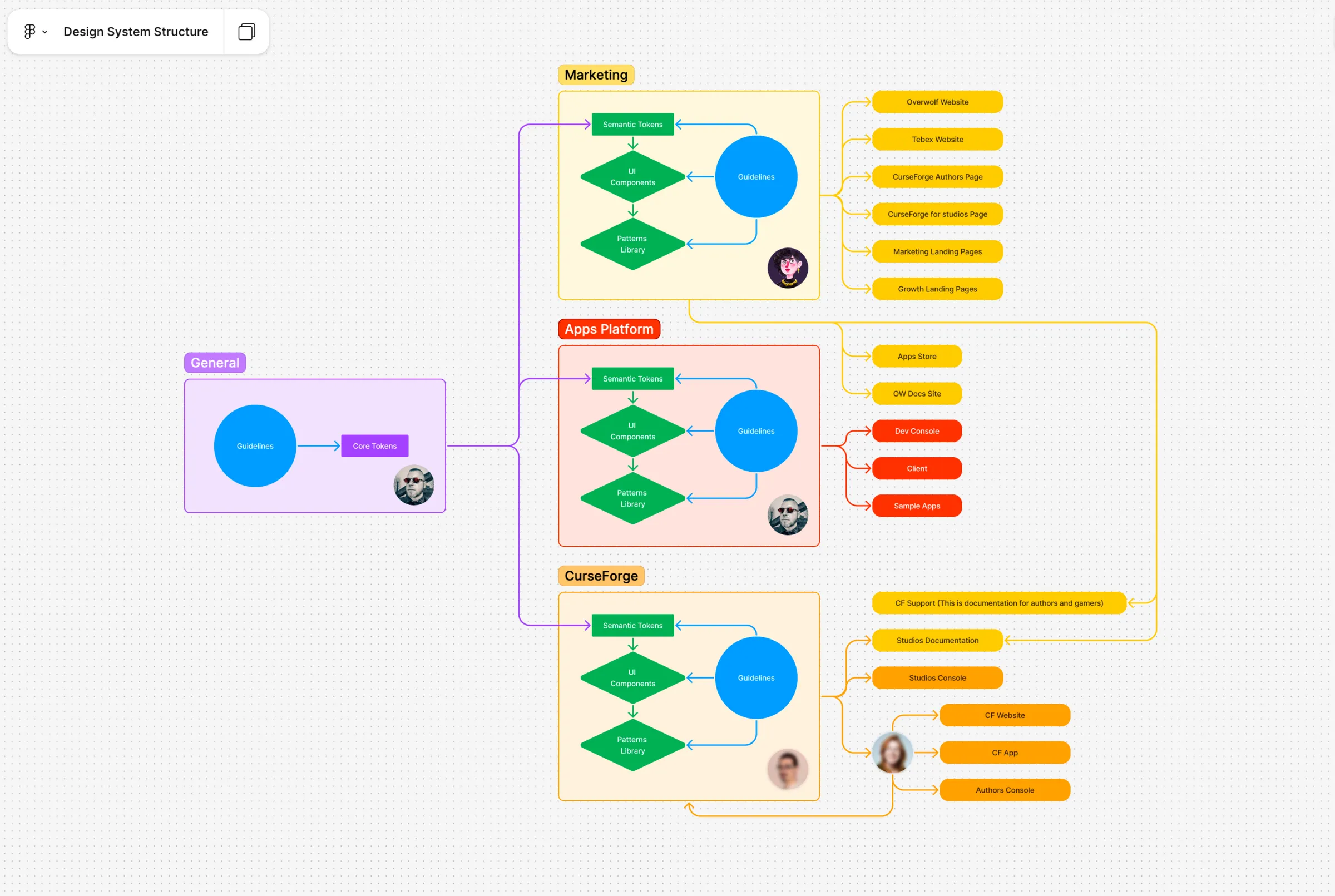
One foundation feeding three domains
Component refactoring continues across all three domains on the semantic foundation.
One Core layer exists outside the domains, with each domain keeping its own components but referencing the same primitives and semantic vocabulary.
Reflection
What I’d do differently
Validate engineering in discovery
If we had identified “different development environments” earlier, the foundation could have supported universal adoption rather than just the web. The web-first compromise remains my main regret about this project.
Instrument baselines before writing the first token
No before-and-after metrics were measured. Even using rough proxies, such as feature ship time or the number of hardcoded colors, would have provided more defensible results than relying solely on qualitative outcomes. For a year-long systems project, this represents a missed opportunity.
What I took from this
- The system architecture needs to match the problem the team actually faces, not the problem a textbook says they’ll eventually face.